The Color Conundrum: Dan Reid
How Much Color Variance Is Acceptable?
Our color management guru explains how digital printers can match colors well enough to satisfy their clients.
PRINT HAS UNQUESTIONABLY evolved from craft printing, where the press operator’s experience of achieving a color match to a “contract proof” distinguished one printing company from another. Today, we have better color measurement devices and methods to move from craft printing to print manufacturing. With any manufacturing process, there are tolerances of what is acceptable and unacceptable for a consistent product.
Think about the manufacturing of PVC pipes. There are well-defined specifications and tolerances of what is acceptable. If the manufactured pipe is out of tolerance, then it won’t mesh with other same-sized PVC pipes. Similarly, if your printing process color varies outside an agreed tolerance, then you could be putting work out the door that may not be consistent with a previous print campaign from the client.
A common complaint is the client’s brand colors don’t appear to be the same – it’s not uncommon for a print campaign to be done across several printing technologies. How do you know if the brand colors are the same on all printing processes used for the same campaign?
DeltaE | ∆E | dE
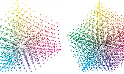
DeltaE is a metric to communicate how different a measured color is to a reference. DeltaE is useful to determine the variance from a reference. The color variance can be evaluated in ∆L*, ∆a*, ∆b*of LAB, or better-using LAB’s cousin, LCH (lightness, chroma, hue). This info helps in pointing to where the deviation is occurring. Is the measured color the correct color (hue)? Does the color have the correct color saturation (chroma)? dE is also useful for checking neutrality with ∆CH (chroma and hue).
Advertisement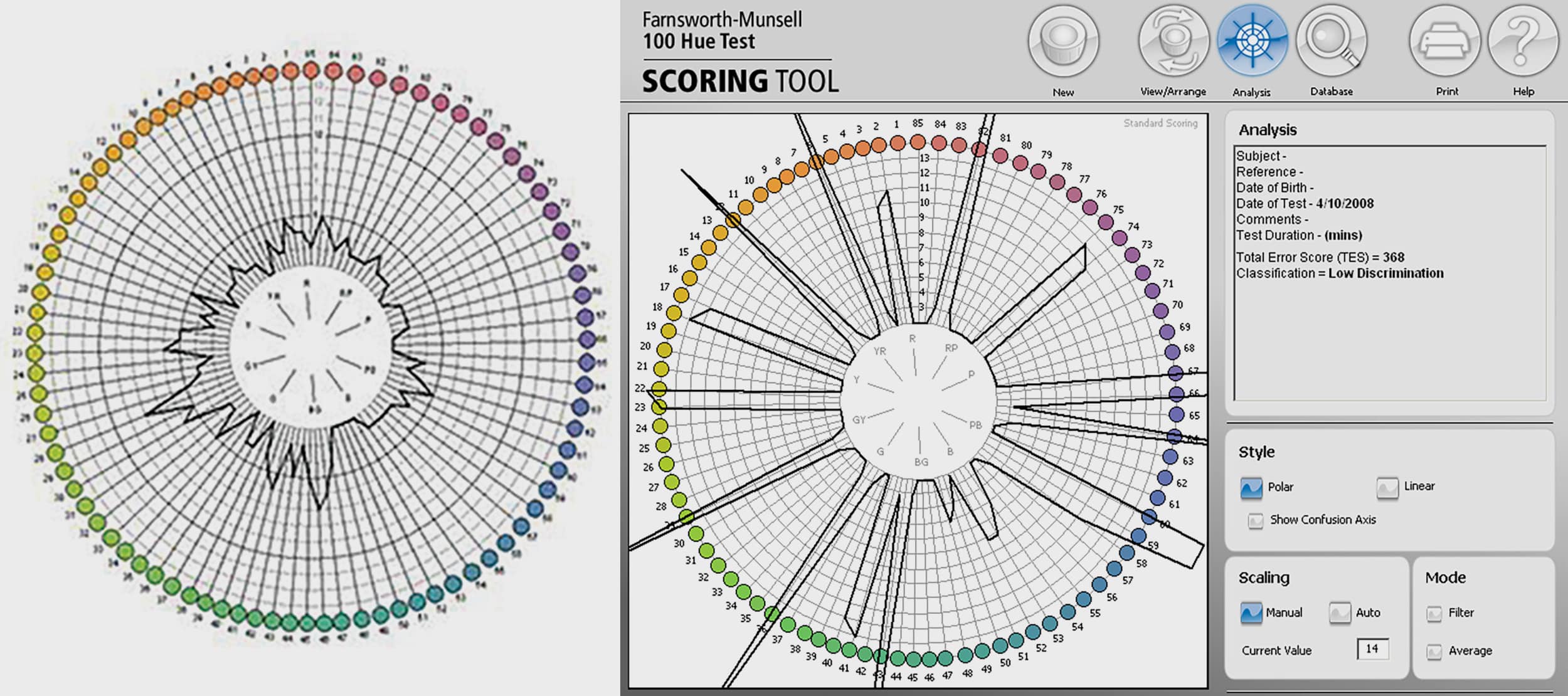
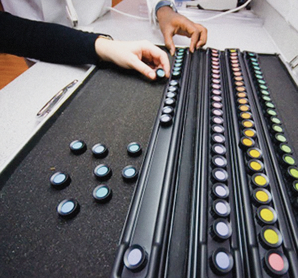
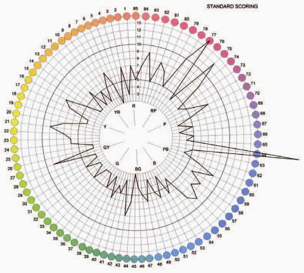
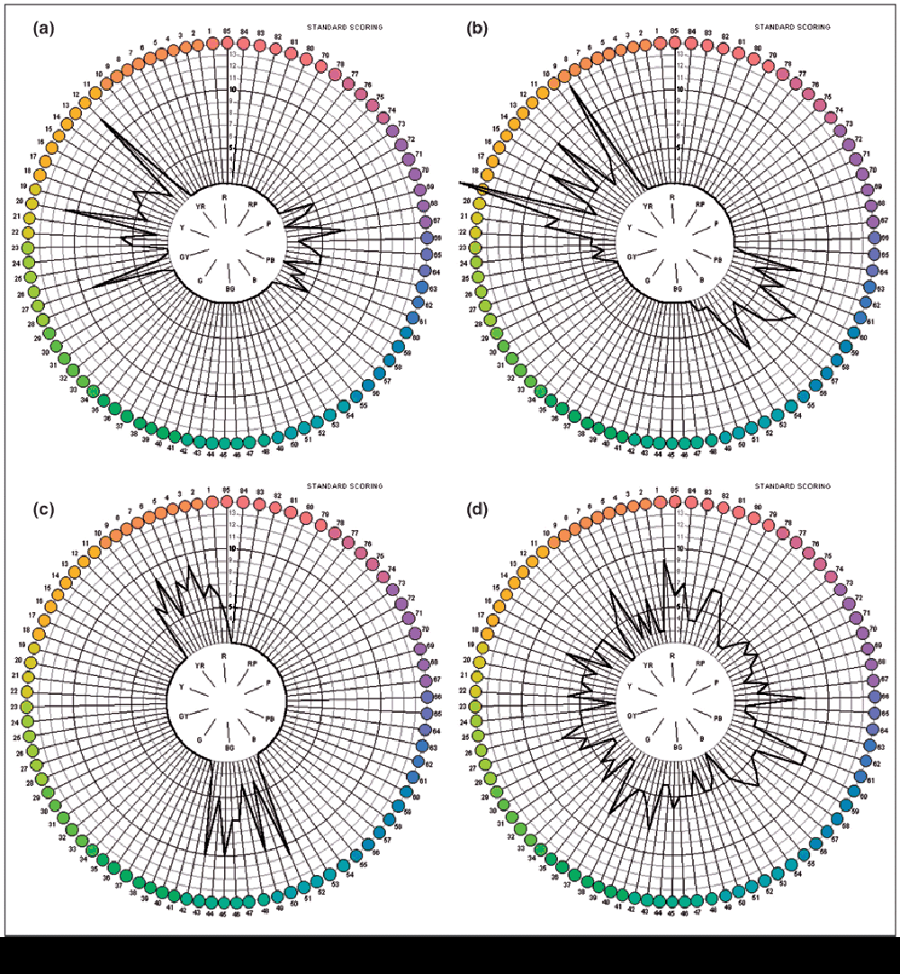
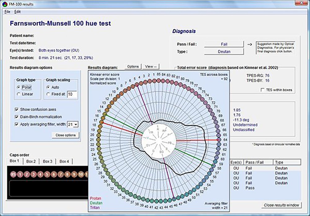
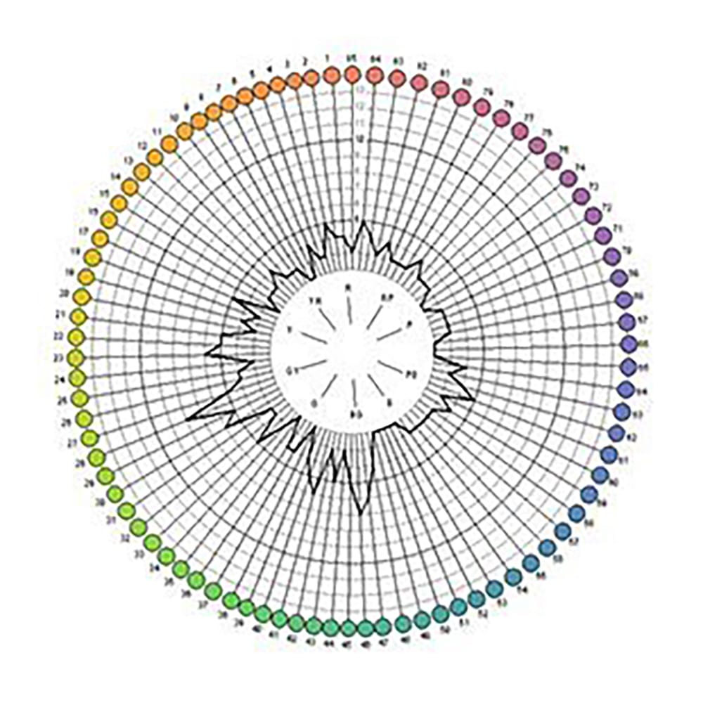
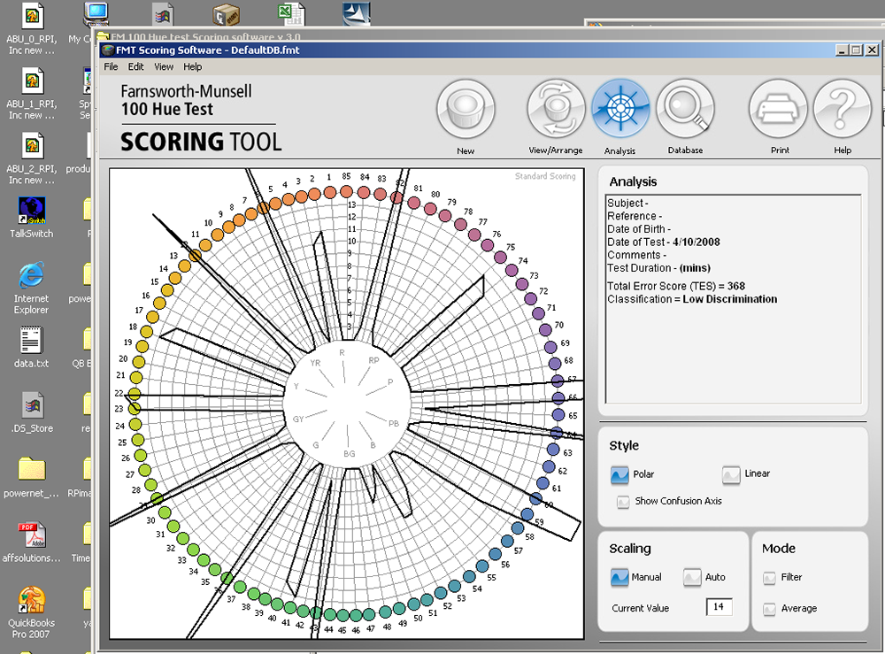
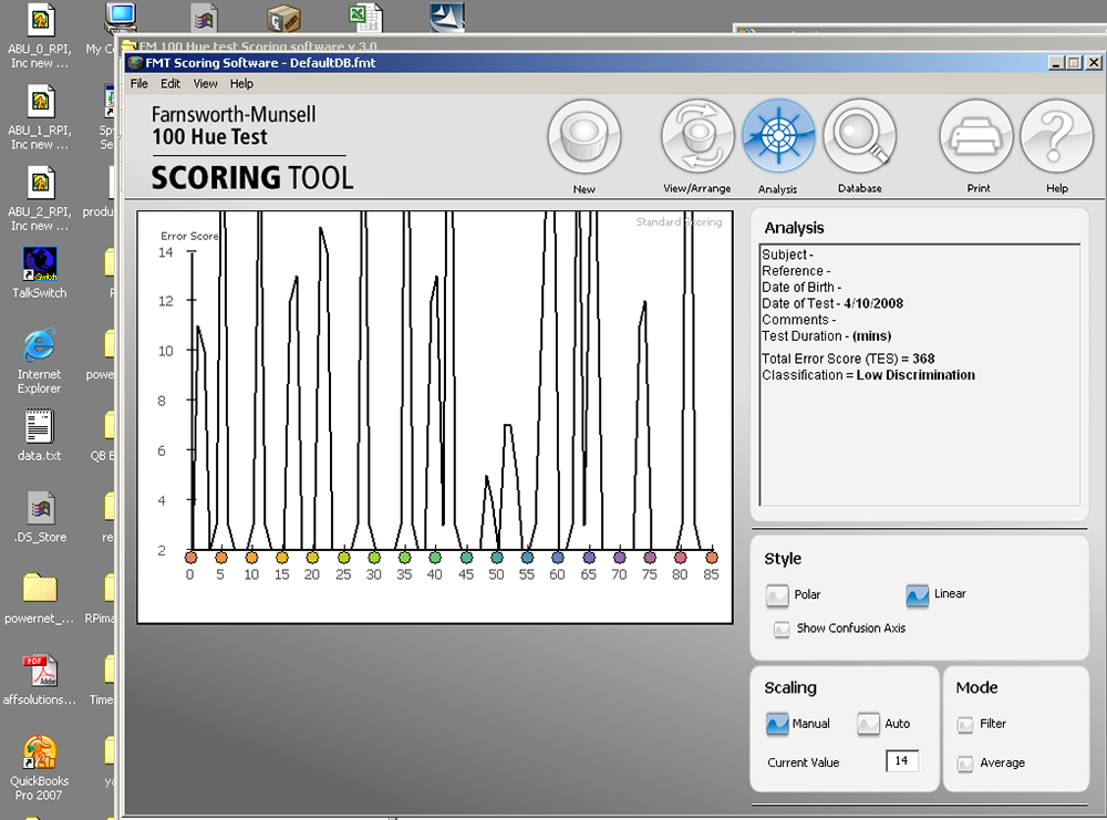
The Farnsworth Munsell 100 Hue test characterizes an individual’s color sensitivity.
We All Interpret Color Differently
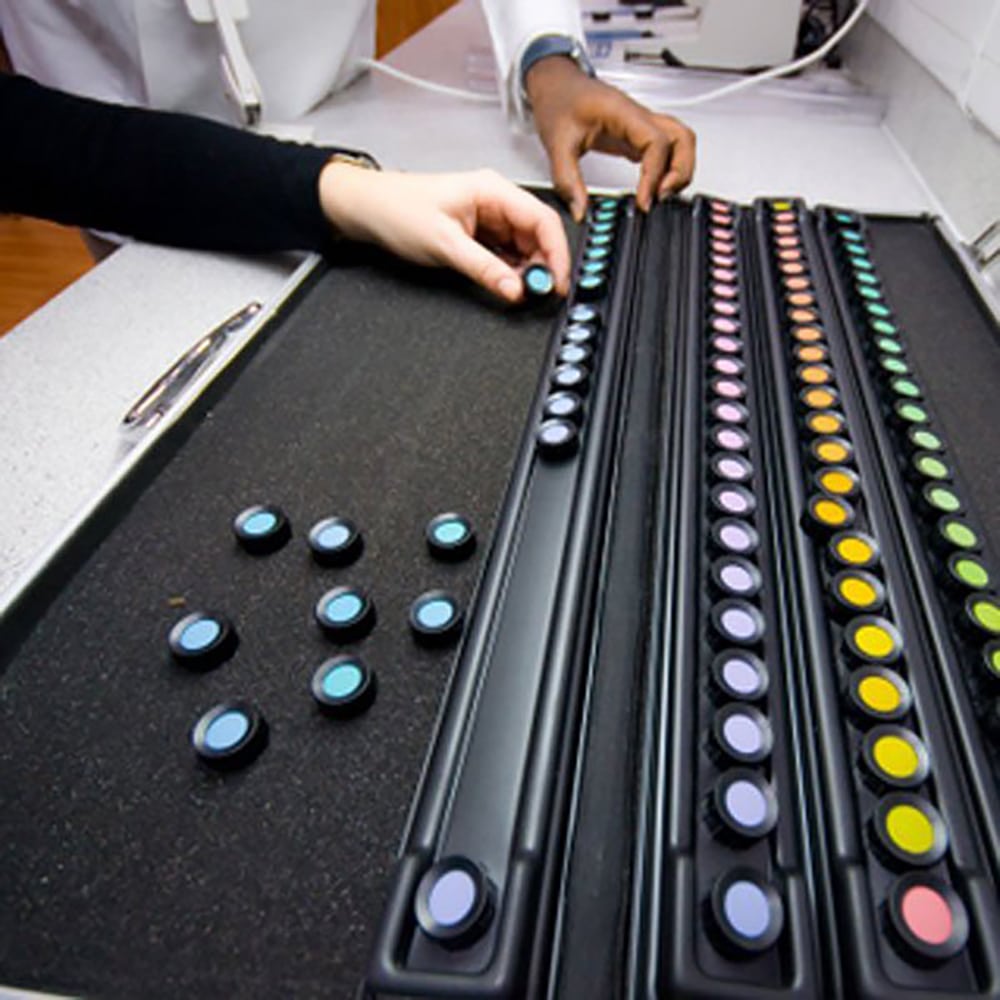
There will always be a variance in print. The question is how much variance is acceptable? Turns out this is very personal. Most people have some level of color blindness. The Farnworth Munsell 100 Hue Test is designed to capture color sensitivity and score the individual so it’s known what areas the participant may have partial colorblindness.
There’s an online version of the test, which is more of a game than something you can trust. The physical version requires the test be administered under D50 lighting so to not introduce a bias from the light source in the test results.
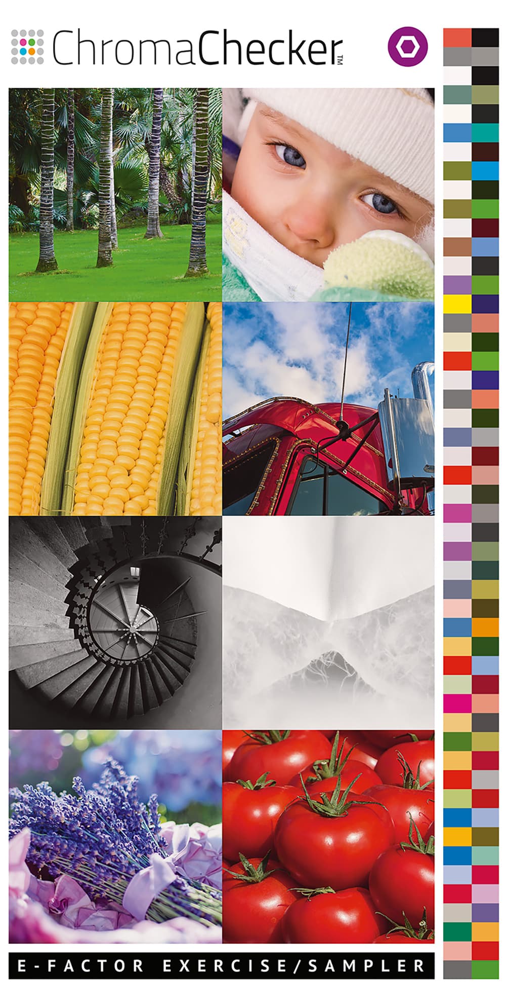
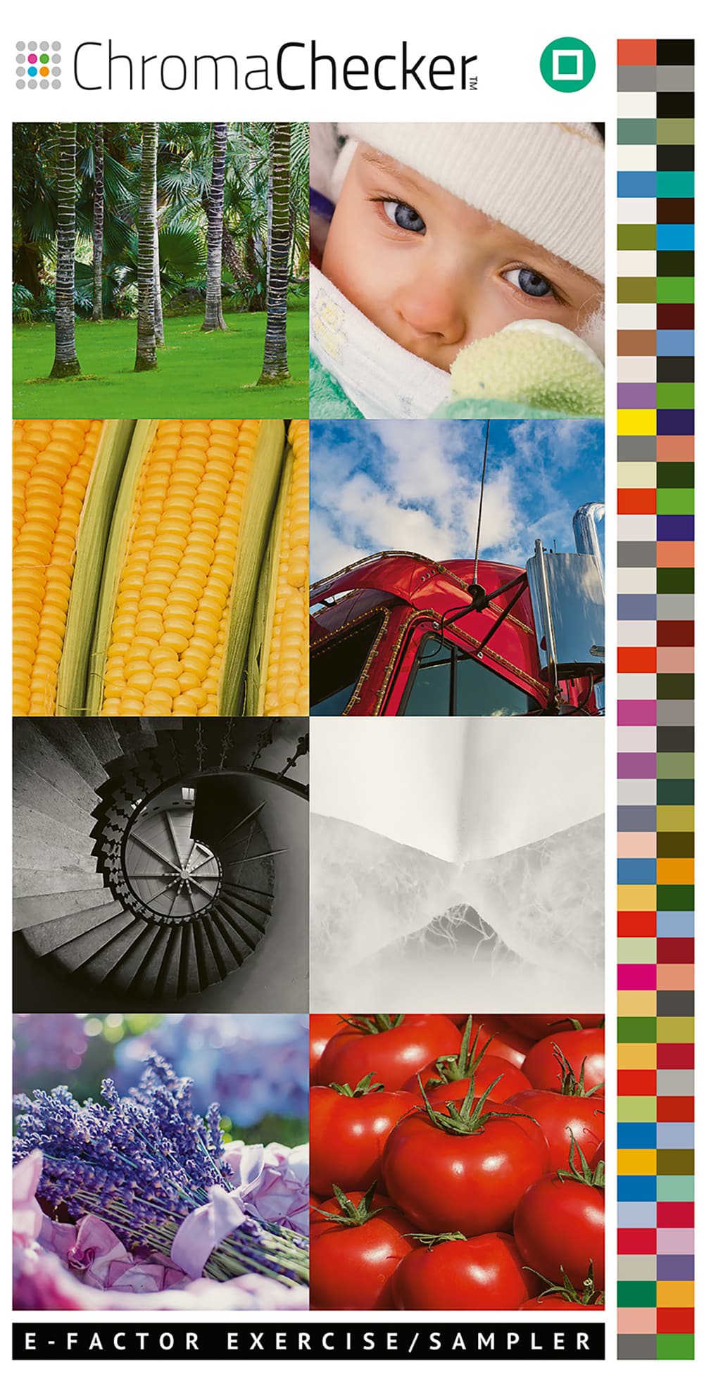
While the FM 100 Hue Test characterizes a person’s color blindness, it does not address what 2dE or 5dE looks like. Online color tracking service ChromaChecker.com has an online and printed version of their Personal eFactor Chart.
“E-Factor Sampler enables you to quickly visualize the different E-Factors from 2 to 9 (based on selected production batch) using the cards from your set. It also enables the user to find the pair of cards that is closest to the desired E-Factor value,” according to the site.
The purpose of the test is not to find the closest match or see a difference, but rather to know whether that variance will be acceptable for your clients. A lower ∆E results in a higher cost to maintain a tighter tolerance. Sometimes it’s just not possible given the print technology, materials, and ambient conditions to meet a desired color tolerance. There’s going to be some variance.
In consumables, manufacturers have their own tolerance of what’s acceptable, which will in turn impact your variance. If the white point of a printing substrate varies 0.50dE00 or more from one batch to the next, then it will be almost impossible to maintain a 2dE with possible 25-percent variance just for the media alone. If the ink changes slightly from batch to batch, then that could account for another 0.20dE variance. So, the remaining variance would allow 1.5+/- ∆E for the printer to drift. That’s unrealistic, which is why it’s important to set a realistic expectation of the variance based on what’s happening on press and what is acceptable for customers.
Advertisement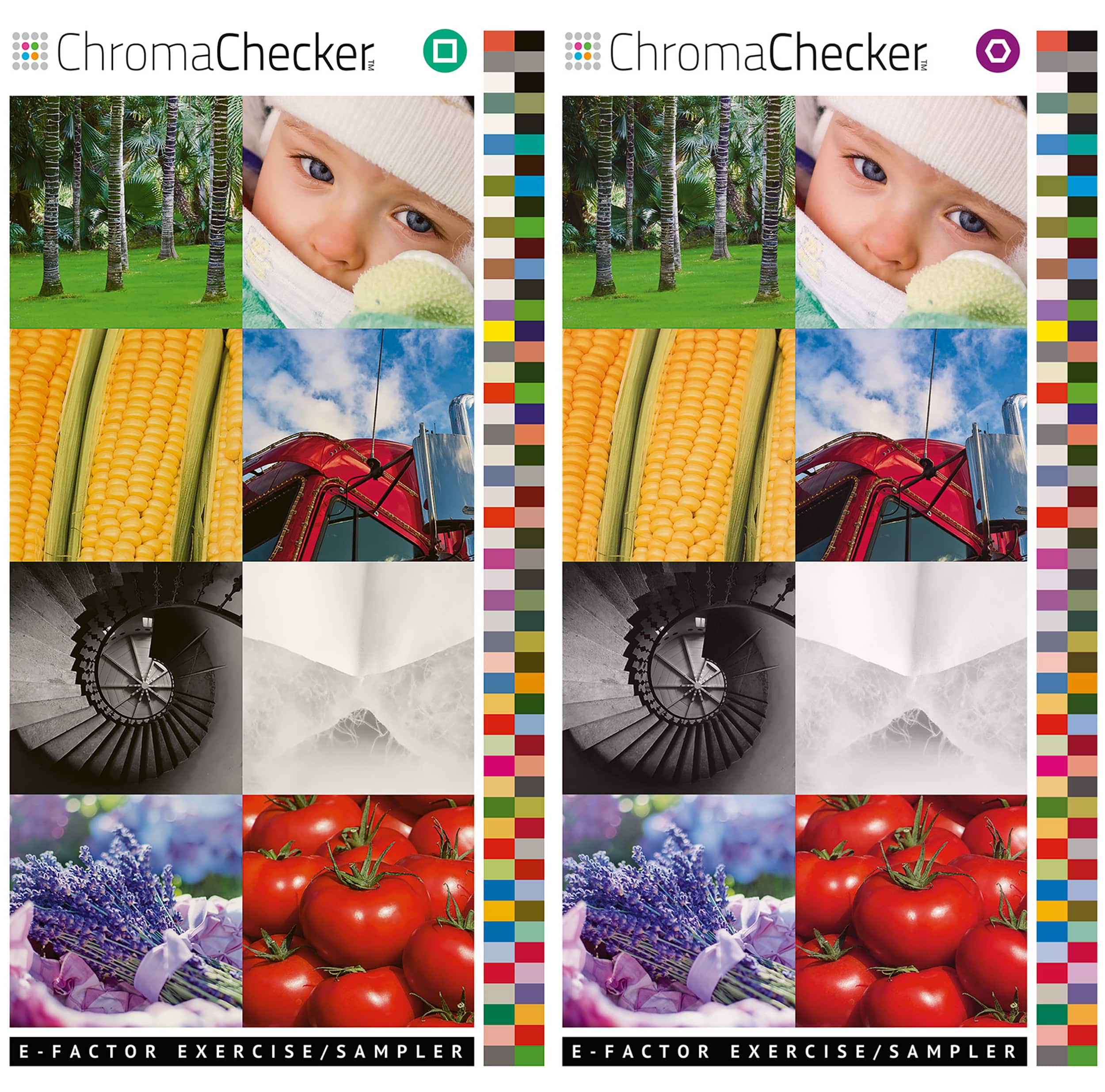
The E-Factor exercise is helpful to determine what is the acceptable variance before a job will be rejected. Tighter tolerances require more work to maintain at a higher cost.
ISO (International Standards Organization)
There’s excellent documentation from ISO (International Standards Organization) for achieving consistent print color. When an ISO specification is published, it means several countries got together and agreed on something and it becomes ISO standard. There’s a whole slew of ISO standards for print that start with press ink color and move to lighting specifications for evaluating color. One of the best aspects of these published standards are that they provide tolerances for acceptable color variance.
Start Today
Popular RIPs all offer modules to check variance from a color reference. They all include ISO standard color tolerances as a starting point. You may need to relax or tighten these tolerances based on your print technology, consumables, and customer expectations.
PHOTO GALLERY (11 IMAGES)
Printvinyl Scored Print Media
New Printvinyl Scored wide-format print media features an easy-to-remove scored liner for creating decals, product stickers, packaging labels, and more. The precision-scored liner, with a 1.25” spacing on a 60” roll, guarantees a seamless and hassle-free removal process.


SAi Flexi Complete Sign-Making Software

Arcus Printers Barracuda Conveyor Flatbed Cutter

California Company’s Worst-Ever Typo? It’s a Funny Story …

This Wide-Format Pro Started at Age 11, and 32 Years Later, Still Loves What He’s Doing

Wide-Format Printers Share Their Thoughts on Business-Advice Books

3 Things Print Pros Must Do to Build Stronger Relationships in the Interiors Market


Bulletins
Get the most important news and business ideas from Big Picture magazine's news bulletin.


-
 Best of Wide Format2 months ago
Here Are the Winners of the 2024 Best of Wide Format Awards
-
 Best of Wide Format2 months ago
Graphics Turn an Eyesore Cooler Into a Showpiece Promo in Historic Plaza
-
 Blue Print3 weeks ago
This Wide-Format Pro Started at Age 11, and 32 Years Later, Still Loves What He’s Doing
-
 Best of Wide Format2 months ago
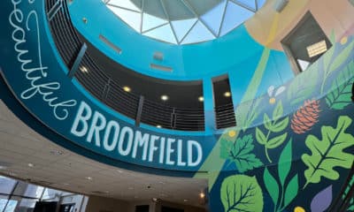
Colorado Town Hypes Its Incredible Natural Gifts in City Hall Rotunda Project
-

 Best of Wide Format2 months ago
Private Customer’s Bespoke Bathroom Wallcovering Showcases Their Passions
-
 Best of Wide Format2 months ago
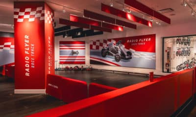
Illinois Print Pros Help Historic Toy Brand Create a Memorable Shopping Environment
-
 Best of Wide Format2 months ago
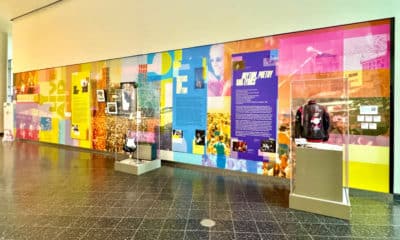
Iconic Music Venue Celebrates Half-Century With Vibrant Exhibit of Rock Artifacts
-

 Best of Wide Format2 months ago
Music Education Company’s Trade Show Display is a Guitar Fit for a Giant