The Color Conundrum: Dan Reid
Pantone Is Still King When It Comes to Color Communication
Color matching has gone down a long and windy road, but some things will never change.
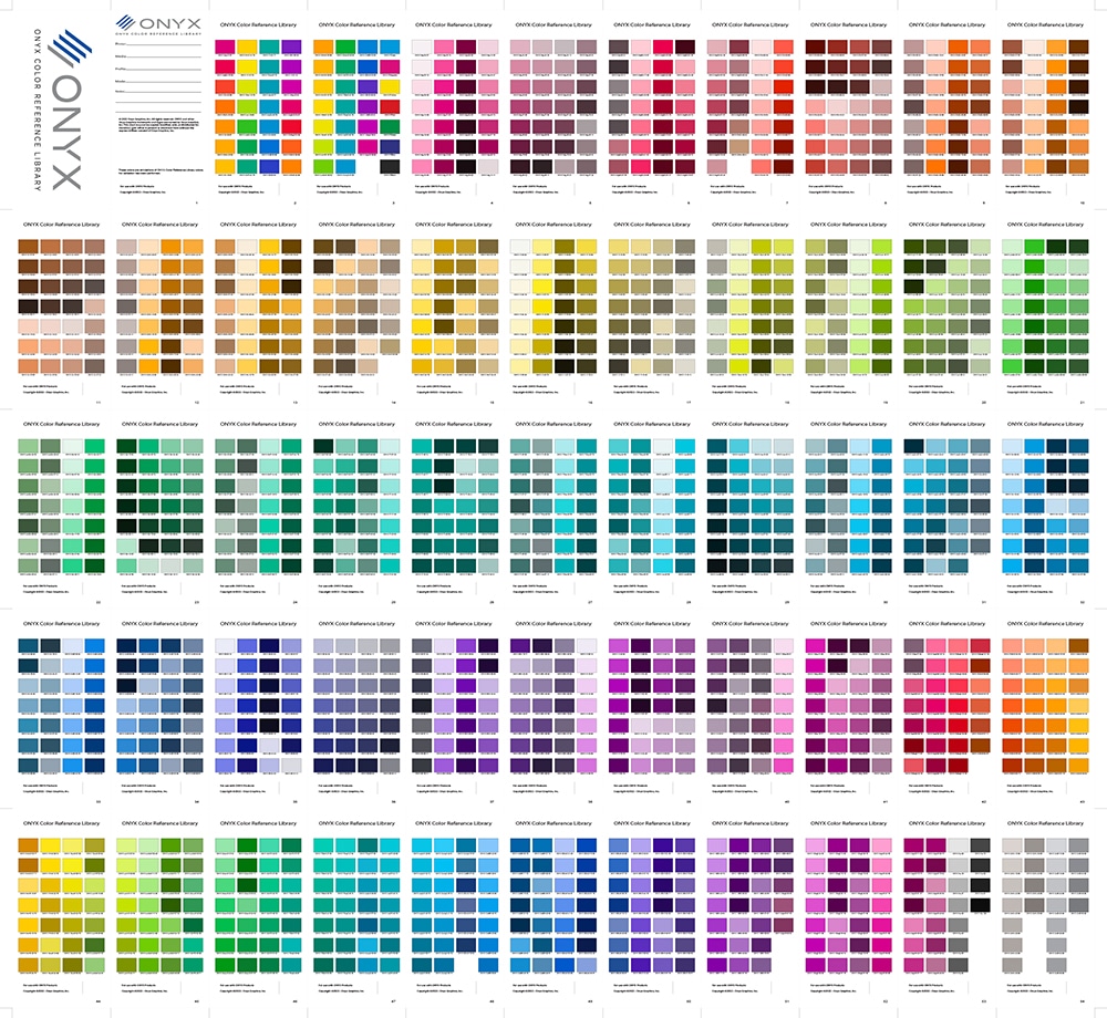
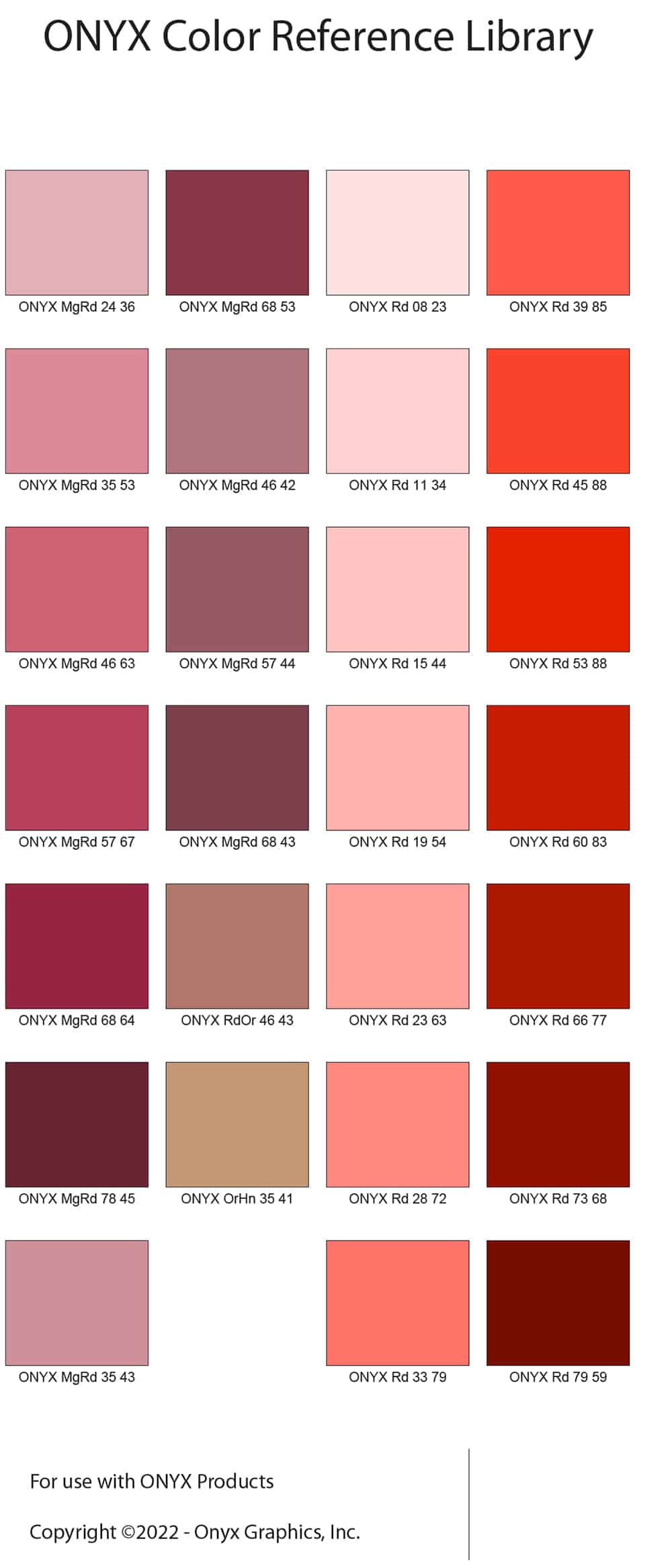
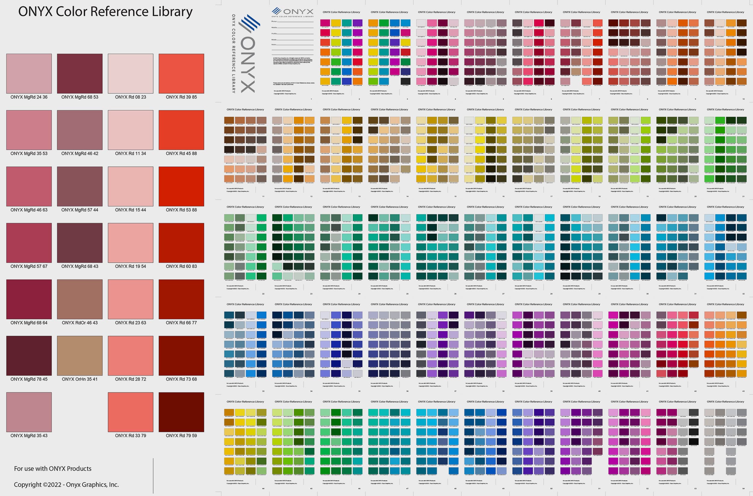 Onyx Thrive22 includes a PDF file to print to see the range of colors possible on your printer, ink, and media.
THE UBIQUITOUS PANTONE fan guide – the Pantone Matching System (PMS) – is an effective and proven way to communicate color intention in print. Long have graphic designers used this system to specify what they would like a color to look like. But sometimes it didn’t translate well to print as the expectation of a color match to a printed Pantone fan book wasn’t met.
Born out of a system of mixing ink (ink formulation) to create a color match, the Pantone system became the unofficial standard for printing in the US. In the ’90s, Pantone was successful in getting designers to use CMYK equivalents to select colors instead of a separate color plate on press, known as spot color, to achieve the desired color match. Confusion began when a spot color could be defined as a separate color ink or as a process color simulation (in CMYK) but listed as a fifth or sixth plate in the file.
Building upon the success of the CMYK equivalents of mixed inks, Pantone noticed the trend toward commercial sheetfed presses with six or more print towers, leading to the development of the Pantone Hexachome. Pantone Hexachome was developed to represent more than 90 percent of the original color (ink) library. Unfortunately, designers in the ’90s were still struggling to make good CMYK separations from RGB files, let alone understand how to make a CMYKOG separation. The process was complex and bleeding edge as it opened up a whole range of printable colors not possible with CMYK. There was merit for the print provider but the complexities of making a good CMYKOG separation were challenging. Pantone Hexachome was officially discontinued in 2016.
Refocusing, Pantone took stock of the common press inks available globally. This led to the Pantone GOE system. Great idea, but it never took hold in the US market.
Pantone went back again to assess and realigned their printing of the beloved PMS books to conform to the current ISO print conditions. This has been a huge help in getting CMYK equivalents to be closer to what could be visual ly similar, aka G7 or a similar color appearance, by adhering to these published ISO standards.
So, in the long run, updating your Pantone books to the current edition will better align to what you are probably printing if you utilize the G7 calibration method of an ISO standard 10128:2009 and ISO 12647. The deviation from the ISO tolerances will lessen your chance of a color match to the current PMS book.
That being said, there’ s a good argument to be made that this is not realistic.
Advertisement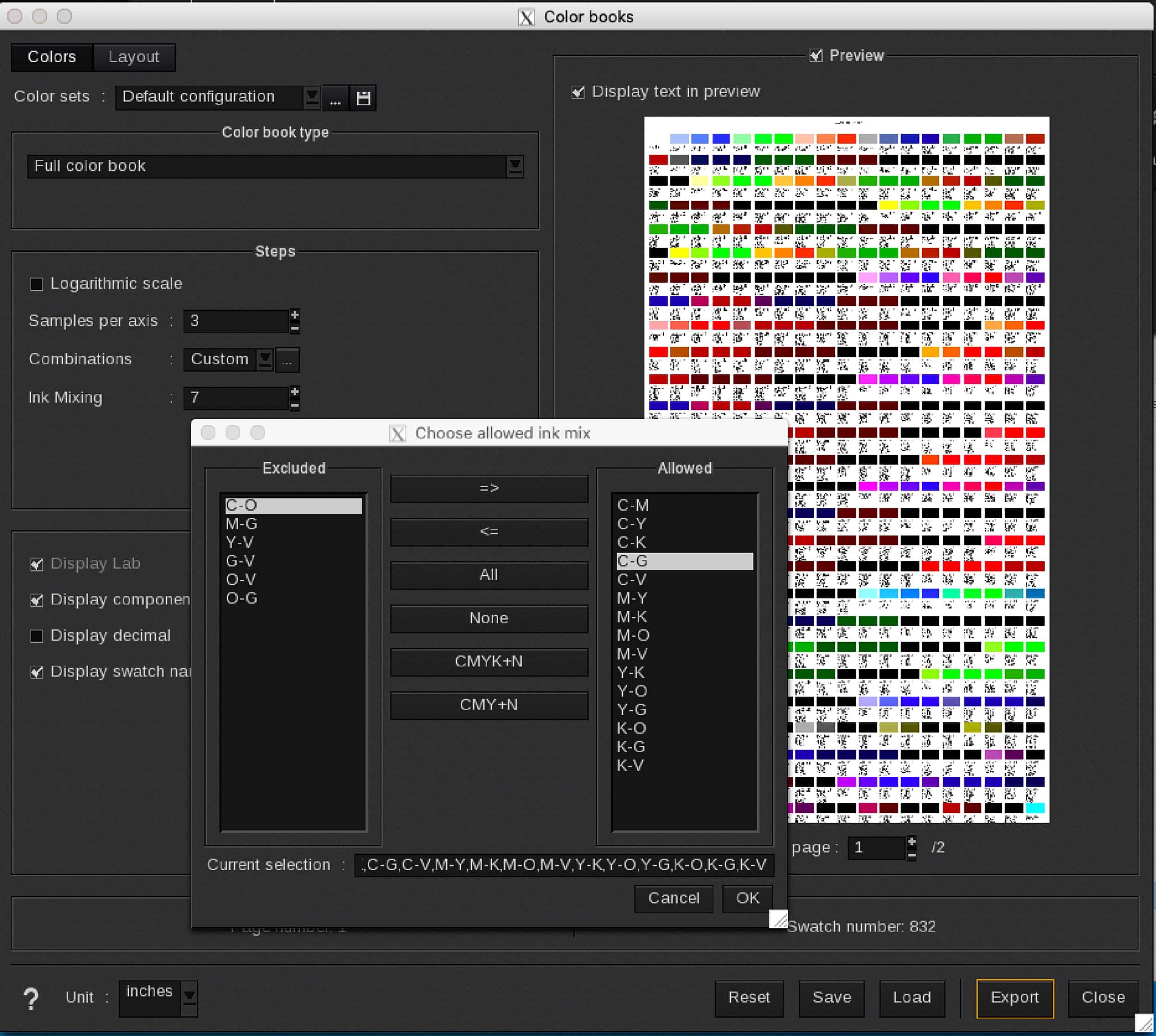
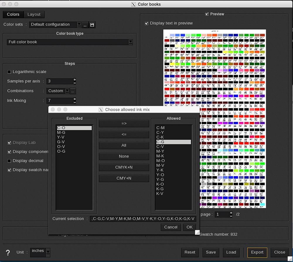
Caldera provides an option to control which color combinations you want in your color chart. Color combinations are based on the ink setup of your printer.
Well, your printer has a finite color range (gamut) for a given ink set, print resolution, and media. Known fact. Can’t turn it up to 11. It makes a lot of sense to print a finite amount of color patches that demonstrate what is actually printable. All common RIP platforms allow you to make a spot color reference library to print and have as a visual reference of what is achievable.
Though limited to a few hundred patches, it really helps in honing in on a color that is close enough visually to what the client would want. That sounds cool, but what if you want to create your own swatch fan books?
As we transition from Adobe, including current shippable Pantone libraries in their product packages, to a Pantone subscription-based model, there are options to consider on how to work with your clients in communicating color expectation beyond a licensed color system.
The Pantone Matching System is arguably the most ubiquitous system for communicating color and it meets the needs of today’s designers with cloud-based sharing of color palettes among colleagues and suppliers. Pantone’s ColorCert program enables print service providers to put a QA program in place to meet the tolerances needed to achieve an effective color match to the current Pantone Matching System, PMS.
PHOTO GALLERY (3 IMAGES)
Printvinyl Scored Print Media
New Printvinyl Scored wide-format print media features an easy-to-remove scored liner for creating decals, product stickers, packaging labels, and more. The precision-scored liner, with a 1.25” spacing on a 60” roll, guarantees a seamless and hassle-free removal process.


Check Out the Great Info in the July/August Issue

National Workaholics Day, Interns Day, and More July/August Dates for Print Pros

Kill an Obsolete Project, Survey Competitor’s Websites, and More To-Dos for July/August


Bulletins
Get the most important news and business ideas from Big Picture magazine’s news bulletin.


-

 VEHICLE WRAPS + GRAPHICS3 weeks ago
As the Wrap Market Surges, Technology Keeps Improving
-
 Press Releases3 weeks ago
MUTOH Wins 2024 EDP Award “Direct to Shape Printer” for Its XpertJet 1462UF
-

 Case Studies3 weeks ago
At This Pennsylvania Printer, Color Consistency is King
-

 Case Studies1 week ago
Former Frito Lay Delivery Van Becomes an Eye-Catching Catering Vehicle
-

 Benchmarks3 weeks ago
3 Food Truck Wraps Where Skilled Designers Overcame Tough Technical Challenges
-

 Press Releases2 months ago
Avery Dennison Sponsors 2024 Design-a-Bus-Wrap Student Art Contest
-

 Press Releases3 weeks ago
PRINTING United Alliance Announces 2024 Pinnacle Award Winners
-

 Press Releases2 months ago
Konica Minolta’s AccurioJet KM-1e Shines at 2024 In-Print Awards