The Color Conundrum: Dan Reid
This Is How Printers Can Match the Color Your Client Is Requesting
Start by asking the client for a sample of what they think the color is supposed to look like.
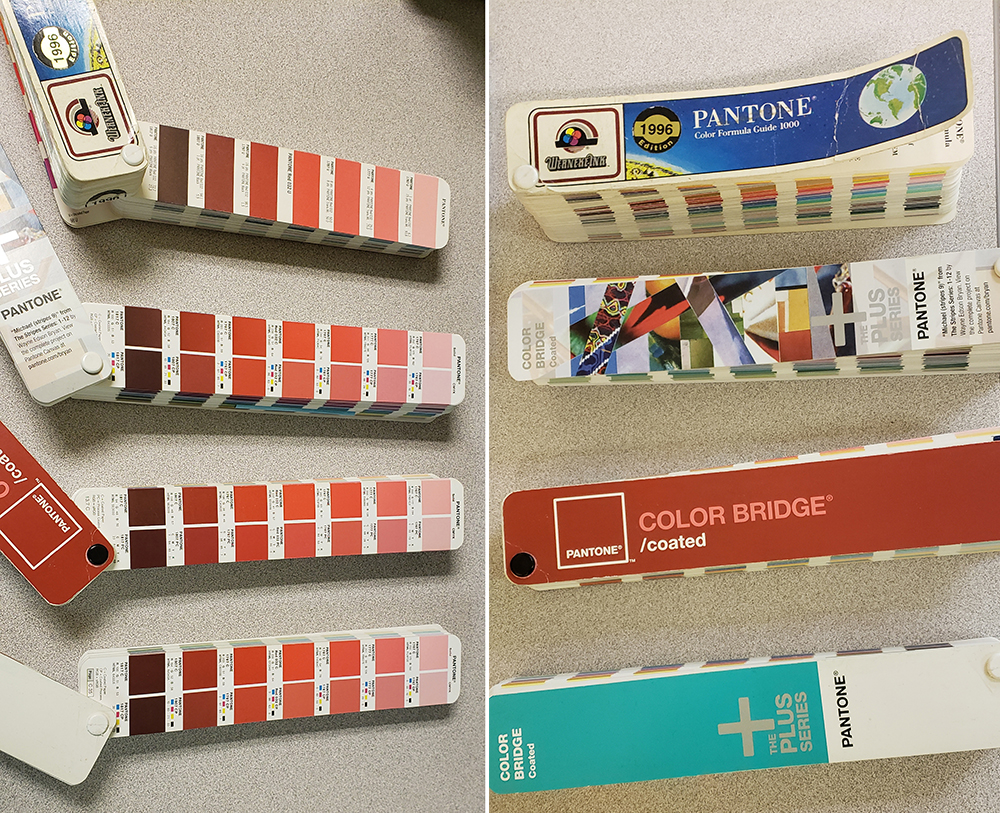 Which CMYK values are the correct values to use in an Adobe app? None. Pantone books have evolved over the years and those numbers do not reflect current (offset) printing conditions, nor the values reported in current Adobe apps. I hope your Pantone books are in better shape than these.
IT’S COMMON FOR print jobs to be sent in with a color designation of what the final product should look like. Every printing company wants to achieve similar color across medias and printing technologies, but there’s always a limitation on the range of reproducible color by device and media.
There are several ways to communicate what someone wants for color output. But there have been plenty of times when I’ve seen people convert spot colors to process (CMYK) or ignore ICC color profiles. When this happens, sometimes those RGB or CMYK values have new meaning and thus look different. This leads to people “fixing” files and not understanding they may have just assumed the wrong color space.
Tagging objects with an ICC profile removes the ambiguity of what those values mean in RGB or CMYK. But these color models are restricted by a device’s color range or color gamut.
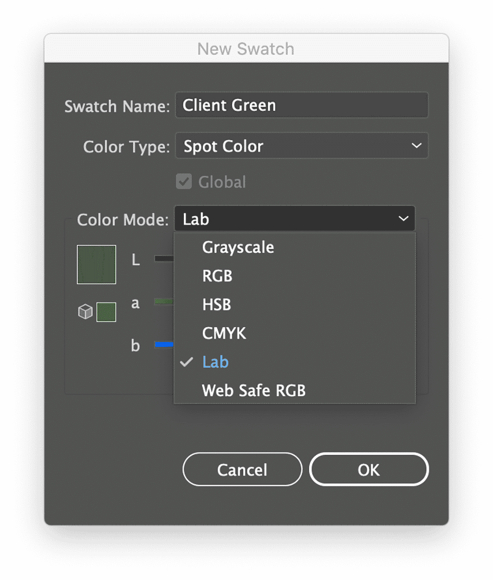
Spot Colors are independent of RGB and CMYK and are more easily controlled at a RIP. Spot colors are seen as additional printing plates in the PDF or channels in Adobe Photoshop/AI.
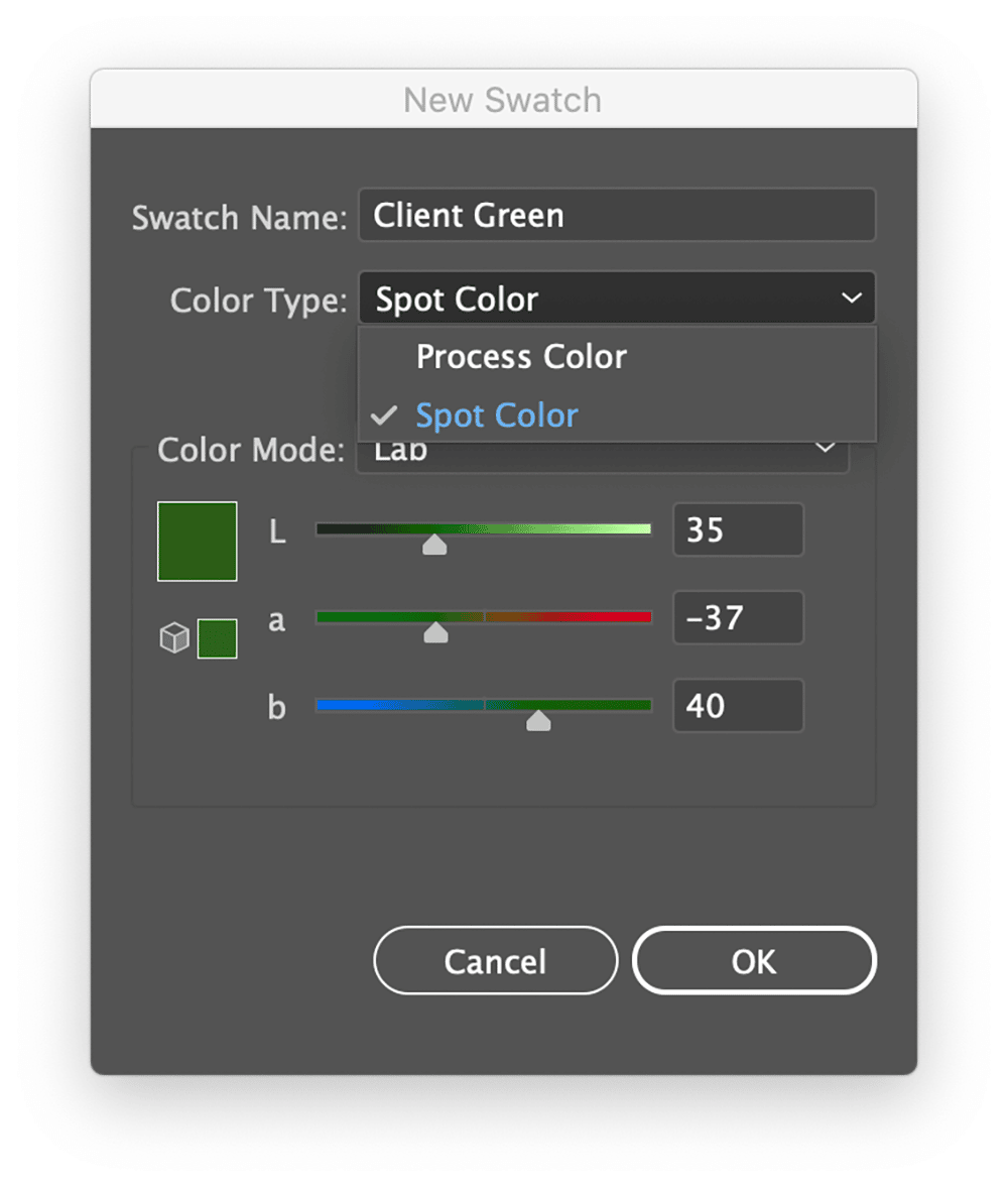
You can create a Spot Color that has a RGB or CMYK definition, but the real benefit is using the LAB color model instead. A LAB color definition is not restrictive to a device color gamut, rather it’s a weighted model of how we perceive color independent of a printing device. So, we’re defining this not based on a particular device or paper, but rather how we perceive that color agnostic of a printing device.
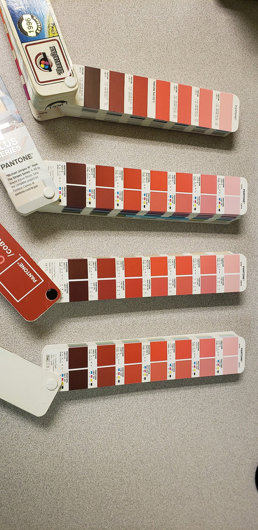
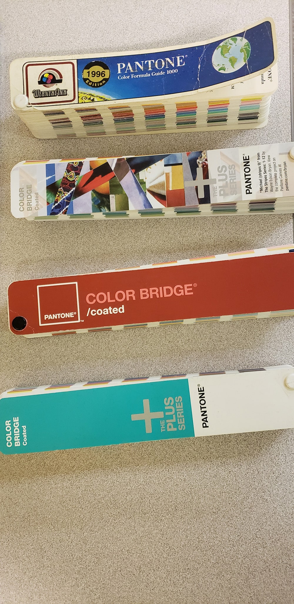
It’s common to find color designations like the Pantone Matching System (PMS) as a way to communicate what that color could look like. The changes in the printed fan books over the years, however, necessitates these to be used as guides and not absolutes. A Pantone guide from five to eight years ago is going to look slightly different. It may have been used a lot and is ragged, or left in a closed drawer most of the time. So, when someone grabs a color fan book and starts comparing their guide against a print, consider that both of you may be wrong. What??
The licensed PMS libraries your software is using may not correlate to the guide in hand. Each RIP software company pays a licensing fee to Pantone for use in their product. I’ve noted different PMS library versions installed on the most popular RIPs. This in turn means you would get different results from each RIP.
So, again, the fan deck you’re looking at may not correlate with the PMS libraries being used with your RIP or Adobe products.
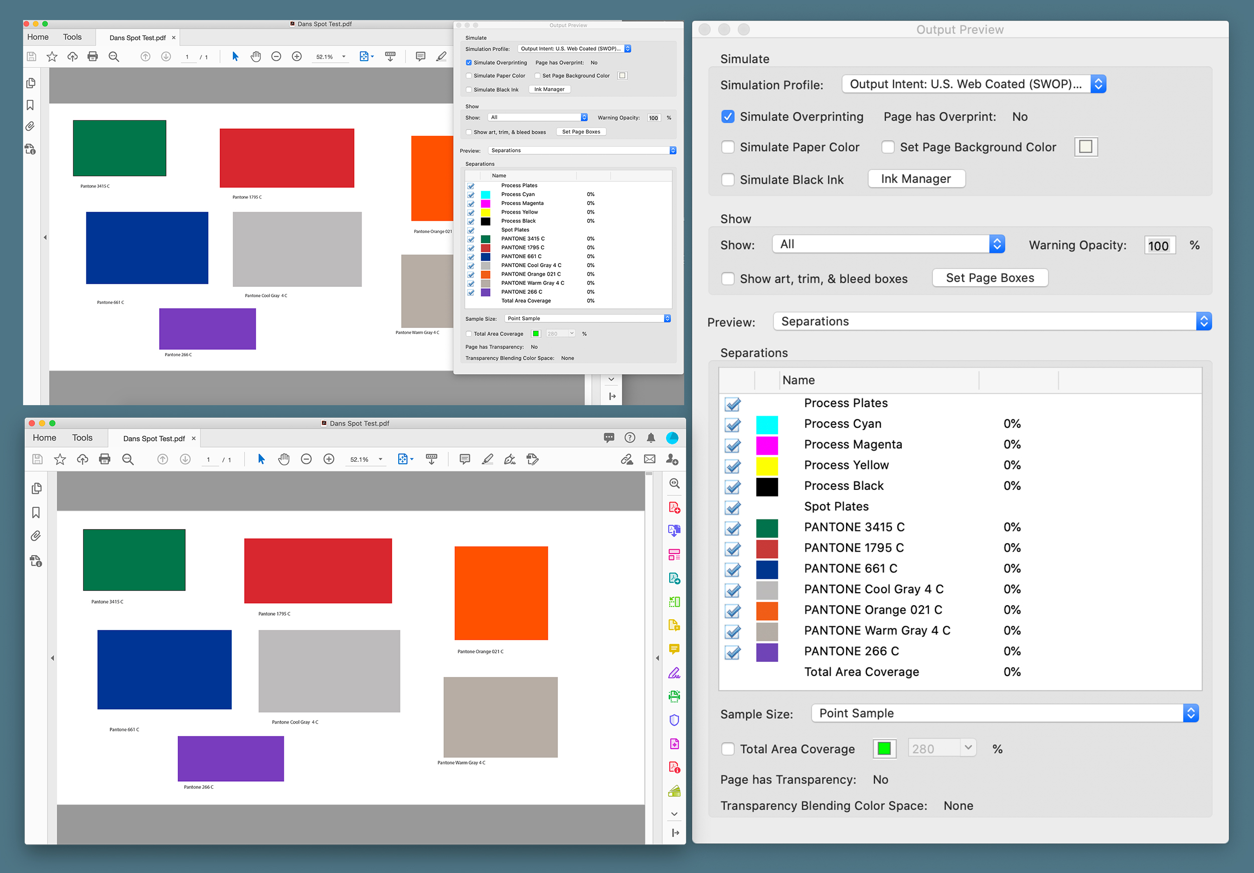
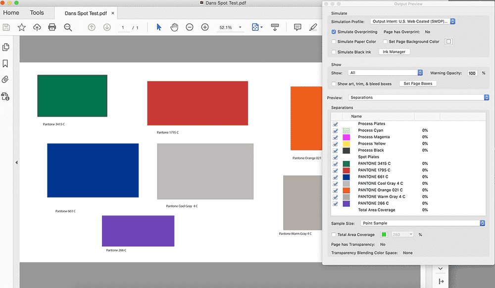
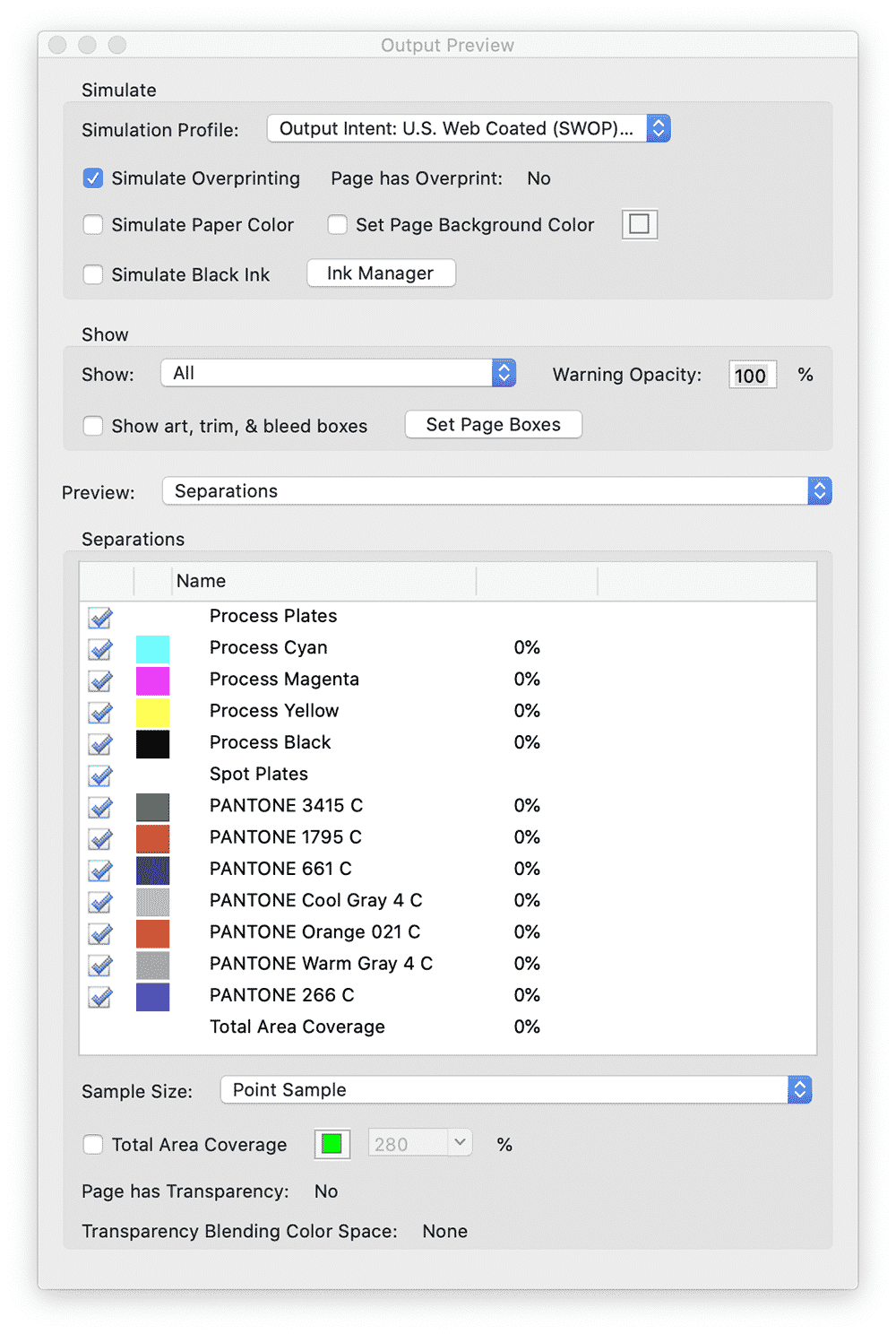
In Adobe Acrobat Pro DC, there’s a module included called “Print Production.” Here’s the “Output Preview” tool to see how the file is set up for color. The spot colors are listed correctly and are not converted to CMYK (process plates). The APPE (Adobe PDF Print Engine) of current popular RIPs will be able to recognize these color definitions.
As you may know, Pantone and Adobe have severed their relationship. Pantone customers will now purchase a subscription to access the new libraries and custom libraries shared by Pantone Connect for Adobe Creative Cloud. Older Pantone libraries will still be available but will not correlate to the newer fan guides shipping today nor include new colors released. There were 294 new colors added in the 2019 edition.
The latest PMS guides now conform to the best practice approach of G7 print calibration method and CRPC3 and CRPC6 color references for uncoated and coated. This is an excellent step forward to bring the CMYK values listed in the Pantone Color Bridge Guide Set | Coated and Uncoated to be in sync with current GRACoL2013 aka CRPC6 specifications.
That’s all fine and good, but what does a client really want? It’s not the color designation they think they want. Why? Because every printing company is providing an interpretation of that color. No one is mixing ink and putting that ink into their press. Everyone is making an interpretation of what the system thinks that color is supposed to look like. So, really, the color definition is whatever the client is willing to accept as the interpretation.
At the end of the day, it’s really about the client’s reference in their hand. Ask for a sample of what they think the color is supposed to look like. Measure the sample with your spectrophotometer to obtain a LAB number. This will give you a good place to start. Manage any critical colors (independent of RGB and CMYK) using custom spot LAB color definitions of client-approved samples.
PHOTO GALLERY (11 IMAGES)


Printvinyl Scored Print Media
New Printvinyl Scored wide-format print media features an easy-to-remove scored liner for creating decals, product stickers, packaging labels, and more. The precision-scored liner, with a 1.25” spacing on a 60” roll, guarantees a seamless and hassle-free removal process.


Check Your KPIs, Reach Out to 200 Top Customers, and More To-Dos for Print Managers in May-June

National Moving Month, Selfie Day and More Business-Generating Events for May and June

Drupa Seminars to Look at the Potential of Artificial Intelligence in Printing and Imaging

This Wide-Format Pro Started at Age 11, and 32 Years Later, Still Loves What He’s Doing

Wide-Format Printers Share Their Thoughts on Business-Advice Books

3 Things Print Pros Must Do to Build Stronger Relationships in the Interiors Market


Bulletins
Get the most important news and business ideas from Big Picture magazine's news bulletin.


-
 Best of Wide Format2 months ago
Here Are the Winners of the 2024 Best of Wide Format Awards
-
 Best of Wide Format2 months ago
Graphics Turn an Eyesore Cooler Into a Showpiece Promo in Historic Plaza
-
 Blue Print3 weeks ago
This Wide-Format Pro Started at Age 11, and 32 Years Later, Still Loves What He’s Doing
-

 Best of Wide Format2 months ago
Private Customer’s Bespoke Bathroom Wallcovering Showcases Their Passions
-

 Best of Wide Format2 months ago
Colorado Town Hypes Its Incredible Natural Gifts in City Hall Rotunda Project
-

 Best of Wide Format2 months ago
Illinois Print Pros Help Historic Toy Brand Create a Memorable Shopping Environment
-
 Best of Wide Format2 months ago
Iconic Music Venue Celebrates Half-Century With Vibrant Exhibit of Rock Artifacts
-

 Best of Wide Format2 months ago
California Forest Firefighters Use Dynamic Car Wraps to Recruit New Members