Those who drive by the new restaurant can’t help but try to sound out the name. Is it Chee-nnati’s? Shy-nnati’s? The moniker Chi-nnati’s (pronounced Shuh-nnati’s, by the way) is a cross between Chicago and Cincinnati. And if the restaurant can mix elements from the two cities, why can’t the graphics and signage do the same?
To match the whimsical, experimental nature of the restaurant, FRCH Design Worldwide and Harlan Graphics, both based in Cincinnati, created a variety of graphics that mix and contrast the Windy City and the Queen City.
It all began when a Chicago transplant decided to open a pizza place in his adopted hometown. FRCH put shape and color to the owner’s ideas. Matt Wizinsky, FRCH’s lead designer for the project, says the client came to them with the name, the desire to create an authentic experience, but little else. “It was cool, both because it was local and because we were creating a brand from the ground up,” Wizinsky says.
Once similarities and differences between the towns were hashed out (Chicago cows vs. Cincinnati pigs, a mutual love of sports, cultures built around food, and so on), the graphic and signage concepts began to form. Which is when Harlan stepped in to make all those ideas reality. The two companies had worked together in the past, making the process smoother.
“Part of the reason we were awarded the project is because we could do A-Z in-house,” says Harlan’s Tom Wendt. This included not just the digitally printed graphics, but the illuminated signs, ADA signs, and a few architectural elements, not to mention installation of everything.
Harlan Graphics was there for the smallest details and the largest of the large-format jobs. And though Harlan worked on the Chi-nnati’s project for three months, all the signage went up in the final weeks, as per the owner’s request. Even with the vast array of graphics and signage that had to be installed, Harlan’s four-person team took just six days to install everything, both inside and outside.
Advertisement
Here, we’ll take a closer look at the extensive array of graphics that FRCH and Harlan Graphics partnered to create. Check out the gallery for corresponding photos. For more on Harlan and non-digital Chi-nnati's signage, click here.
Who Doesn’t Love Pizza?
“This came from the notion of a reclaimed, repurposed billboard,” says Matt Wizinsky with FRCH. “We wanted something that created a message without being a [literal] sign.” Signage codes prevented putting actual words on the piece, so a mouth-watering solution was found. By creatively arranging pizza condiments to visually say “I love pizza,” the billboard became more of a decoration instead of a sign—as far as the city was concerned—and the restaurant was able to keep its big-city-inspired exterior.
To create the graphics, Harlan ran four 48 x 96-inch, 6mm-thick DiBond panels through its 4-color Inca Columbia printer producing four full-bleed prints; these were then covered with an enamel clearcoat and placed side by side.
Harlan also fabricated and installed the custom-welded aluminum building frame, which arrived onsite pre-built. After the frame was bolted to the building, the four panels were slid into a channel in the frame and bolted into place.
Found Type Funk
The welcome sign behind the hostess stand started out life as two different pieces. When budget concerns arose, however, instead of scrapping one of the pieces, the two pieces were redesigned into one.
The mural art in the background was created by layering and color correcting high-resolution images and typography in Adobe Photoshop and Illustrator. Harlan used its EFI Vutek PressVu UV 320/400 to print onto 13-ounce Fredrix 1008 Solvent Polyflax Canvas wall vinyl. Aside from merging beloved icons from each city, the mural’s background name-drops Cincinnati and Chicago neighborhoods.
Advertisement
The found-type pieces in the foreground were also digitally printed. Harlan ran 12 x 12 inch x 1/2-mil aluminum pieces through an HP Scitex FB6700 flatbed, then attached them to plywood pieces. These were finished with an enamel clearcoat and cleat-mounted to the mural. The type, says Wizinsky, mimics lettering from old warehouses in both cities, one of many nods to their industrial backgrounds.
A separate company created the wooden enclosure for the stand, and the Harlan crew installed the sign in two steps. The mural was put in place, left to sit for a day, then the team installed the printed type and pin-mounted the dimensional, white “Welcome.”
Sightseeing
Photos like these are displayed in groups around the restaurant, and are used to tie together the various interior elements.
Most of the photos were taken by a local photographer. FRCH made recommendations on image selection, and the owner purchased the photos directly. “Image selection was based on…combining imagery reflecting the details of the Cincinnati and Chicago cityscapes that would resonate with residents of either place,” says Wizinsky.
The images were printed with an Océ LightJet 430 onto Kodak Metallic Endura black-and-white and color paper. While there are obvious landmarks like the Sears Tower and Wrigley Field, other shots are of locations known mostly to locals, so there’s something in it for Chicago and Cincinnati natives alike.
Bathroom Branding
No “blah” ADA signage here: Harlan recreated the found-type logo from the hostess stand on polypropylene paper using an 8-color HP Designjet Z6100; a clear, 1/4-inch, non-glare acrylic ADA substrate by Rowmark was added on top. A Beam Dynamic laser was used to die-cut the 1/32-inch letters, and a Vision-2448 Engraving System was used to create the Braille.
Advertisement
Can’t Stand the Heat
Lightbox panels, set above television displays in the bar area, were designed to bring some warmth to the main room. The graphics were designed in Adobe Illustrator, then output using the shop’s Océ LightJet 430 onto backlit Kodak Professional Duratrans display material. Next came an overlay of clear-mount, 1/4-inch, non-glare, clear acrylic. The finished product has a metallic quality.
Tasty Alternatives
As with any project, budget was a concern. Initially, the restaurant’s owner wanted a large mirror engraved with various quotes about pizza, but when the cost of the mirror itself proved prohibitive, the team regrouped and delivered another option.
To solve the problem, Harlan produced this 40 x 60-inch print. Here, it turned to its EFI Vutek PressVu UV 320/400, outputting the graphics onto 13-ounce Fredrix 1008 Solvent Polyflax Canvas; this was then stretched across a wooden frame.
Digital printing enabled FRCH and Harlan to deliver everything the owner asked for instead of scrapping concepts. Sometimes the new ideas required some tweaking, but, “All the visual elements that were conceived were executed,” says Harlan’s Tom Wendt.
Other canvases featured icons that had also been used on the atrium shadowbox and the exterior billboard. These icons were created in Adobe Illustrator as vector art, so scaling them up to large sizes was not an issue.
Shadowboxing
Chi-nnati’s atrium shadowbox is a good example of how all the restaurant’s graphics and signage—even on an assortment of substrates—tie together.
Harlan ran two Evonik Acrylite acrylic panels through its HP Scitex FB6700 and set these apart with an aluminum frame to create depth. The back panel—an acrylic mirror—was printed with the found type logo and then slightly distorted with a 1/2-inch thick clear panel, which was printed on its backside with the same ingredient icons seen throughout the interior. A MultiCam M Series router was used to cut the panels. The shadowbox measures 42 x 84 x 2 inches.
Harlan Graphics
harlangraphics.com
FRCH
frch.com


 Best of Wide Format2 months ago
 Best of Wide Format2 months ago

 Best of Wide Format2 months ago
 Best of Wide Format2 months ago
 Best of Wide Format2 months ago
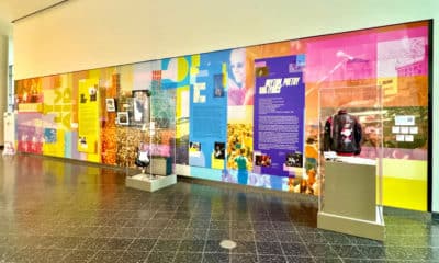
 Best of Wide Format2 months ago
 Best of Wide Format2 months ago