Case Studies
The Top 2019 Wedding Color Palettes
Tips for graphics providers who are in the wedding biz.
Printvinyl Scored Print Media
New Printvinyl Scored wide-format print media features an easy-to-remove scored liner for creating decals, product stickers, packaging labels, and more. The precision-scored liner, with a 1.25” spacing on a 60” roll, guarantees a seamless and hassle-free removal process.


Check Your KPIs, Reach Out to 200 Top Customers, and More To-Dos for Print Managers in May-June

National Moving Month, Selfie Day and More Business-Generating Events for May and June

Drupa Seminars to Look at the Potential of Artificial Intelligence in Printing and Imaging

This Wide-Format Pro Started at Age 11, and 32 Years Later, Still Loves What He’s Doing

Wide-Format Printers Share Their Thoughts on Business-Advice Books

3 Things Print Pros Must Do to Build Stronger Relationships in the Interiors Market


Bulletins
Get the most important news and business ideas from Big Picture magazine's news bulletin.


-
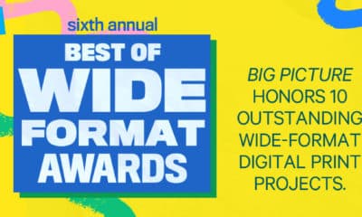
 Best of Wide Format2 months ago
Here Are the Winners of the 2024 Best of Wide Format Awards
-
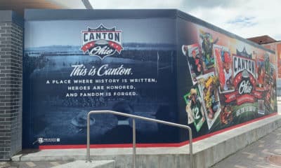
 Best of Wide Format2 months ago
Graphics Turn an Eyesore Cooler Into a Showpiece Promo in Historic Plaza
-
 Blue Print3 weeks ago
This Wide-Format Pro Started at Age 11, and 32 Years Later, Still Loves What He’s Doing
-

 Best of Wide Format2 months ago
Private Customer’s Bespoke Bathroom Wallcovering Showcases Their Passions
-
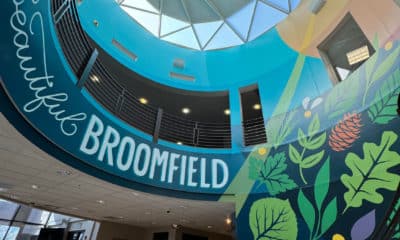
 Best of Wide Format2 months ago
Colorado Town Hypes Its Incredible Natural Gifts in City Hall Rotunda Project
-
 Best of Wide Format2 months ago
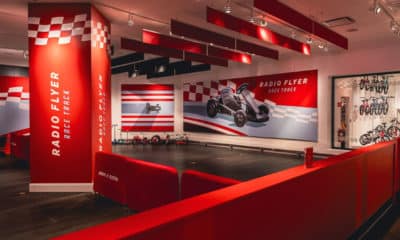
Illinois Print Pros Help Historic Toy Brand Create a Memorable Shopping Environment
-
 Best of Wide Format2 months ago
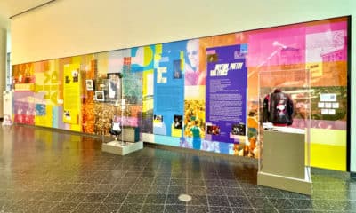
Iconic Music Venue Celebrates Half-Century With Vibrant Exhibit of Rock Artifacts
-
 Best of Wide Format2 months ago
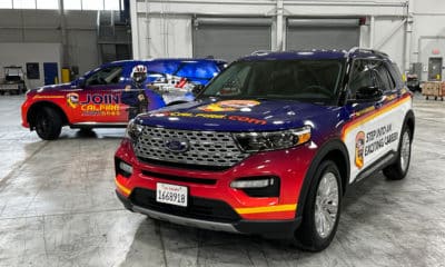
California Forest Firefighters Use Dynamic Car Wraps to Recruit New Members