The Color Conundrum: Dan Reid
Every Client Sees Color Differently – Thankfully, Help Is on the Way
A new standard for color perception is under development and will assist digital printers in meeting client expectations.
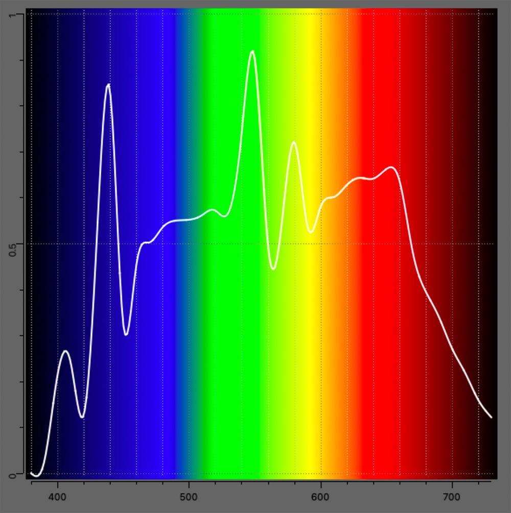
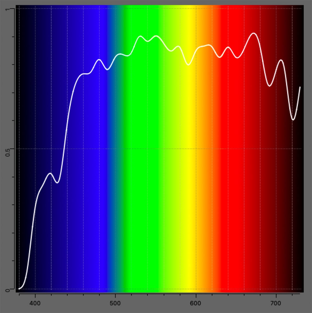
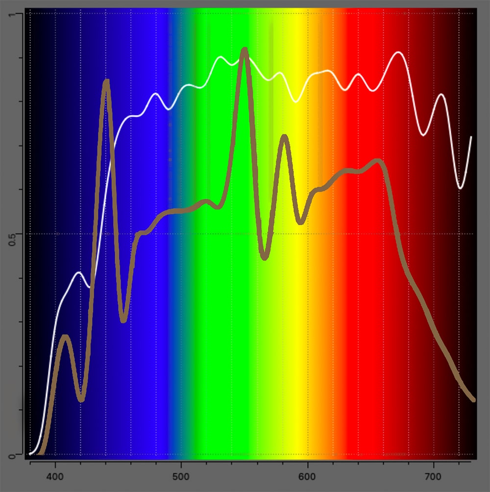
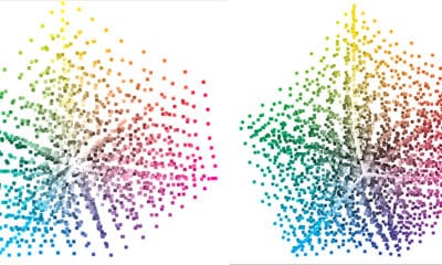
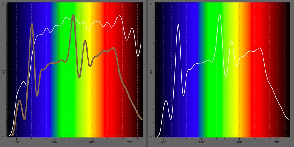 F8 illuminant, fluorescent D50 simulator, versus D50 (Daylight at 5000K).
ANTICIPATING A VIEWER’S experience of a product has always been a challenge. The environment of where a product is viewed should be considered, but also the viewer.
We are pretty good at characterizing print conditions and the materials used, but that’s only one aspect to be considered. There are several variables in play with color perception.
Color perception is based on a viewer (person), an object (printed item), and a light source. We can measure the object to determine how color appears under specific light conditions, but the viewer is a pretty big variable.
Is the viewer hungry, tired, caffeinated, angry, or none of these things? All these conditions affect color perception. I always marvel at stories of late-night press color checks of the past: checking color on each press form. It’s difficult when you’re tired and hungry to discern subtle differences the same as if you were refreshed and fed in the morning.
If the viewer is hungry and in a supermarket, they’re certainly seeing color differently than later after dinner browsing a print catalog in their living room.
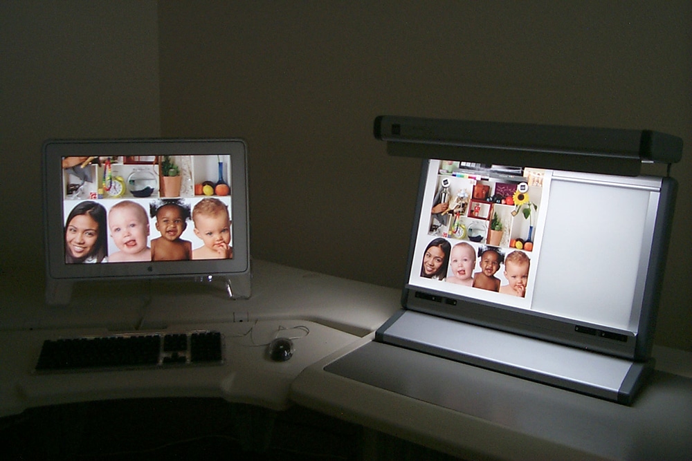
The print provider sometimes is able to account for the anticipated viewing conditions of the product. Sometimes that’s not possible. There are several light booths that allow switching between different light sources to see how the product or print looks under different light conditions. A change of color temperature and/or intensity will affect color perception.
A standard way to evaluate color is critical to color communication. Long has there been guidance on what is an acceptable light source for evaluating color. The graphic arts and printing industry has standardized on D50 (Daylight 500K) as viewing conditions for evaluating color. D50 is not 5000K. D50 refers to spectral power distribution (SPD) of what 5000K should look like across a rainbow or spectrum. Going outside to an open shade area, without direct sunlight, will give you an approximation of D50. Of course, time of year and weather will affect the color temperature, thus the need for daylight (D50) simulators to use inside.
It’s worth noting LAB, used as the conversion from one color space to another, assumes the viewer’s light conditions to be D50. A light source that’s different from D50 will surely impart a bias, making the print’s color to appear off, when in fact the viewing light source is the culprit and not the color match.
The first method of simulating daylight (D50) was by filtering tungsten halogen lamps. An evolution to fluorescent tubes allowed a massive reduction in energy consumption, cost, and improvement to matching the D50 reference.
Advertisement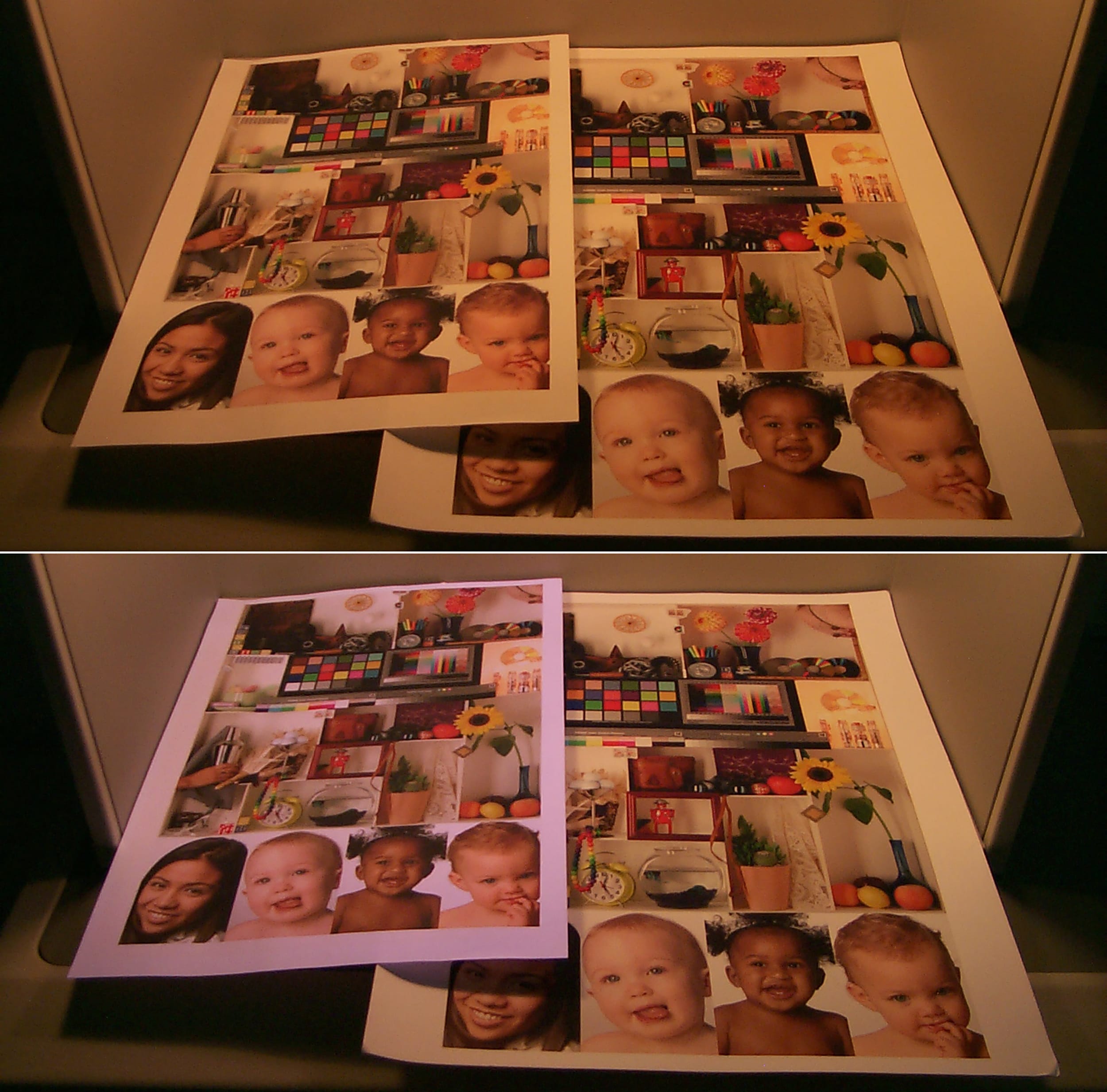
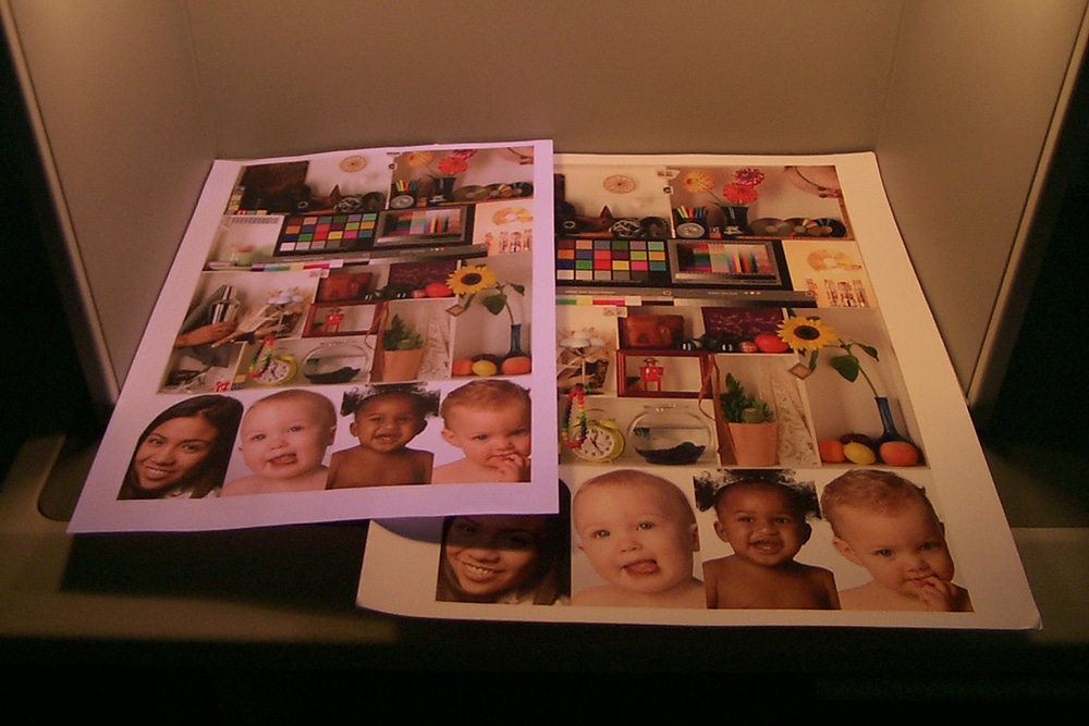
Viewing under different light sources may affect your color perception. Here we are evaluating optical brighteners in papers using a UV lamp. This shows one paper will shift color under different light sources while the other will be less affected.
D50 is specific and excludes “daylight” or “full spectrum” lamps because they are not designed to closely resemble daylight at 5000K. You can have several daylight lamps appear different to your eye but measure as 5000K. Thus, there was a need to define what the tolerances of matching the SPD of D50. They have to be tight enough to ensure the viewing conditions, but loose enough to meet manufacturing tolerances.
ISO 3664:2009 defines the variance allowed for viewing conditions in print and graphic arts. The standard defines many aspects of the viewing conditions including light source chromaticies, viewing area background color, light intensity, or lux, at the viewing area plane, and light intensity fall off from the center to perimeter; all of which affect color perception. It being an ISO standard means a lot of people from different countries got together and agreed this is the way to evaluate color in print. It’s not an opinion or based on a philosophy, but rather an international agreement on how to evaluate color in print.
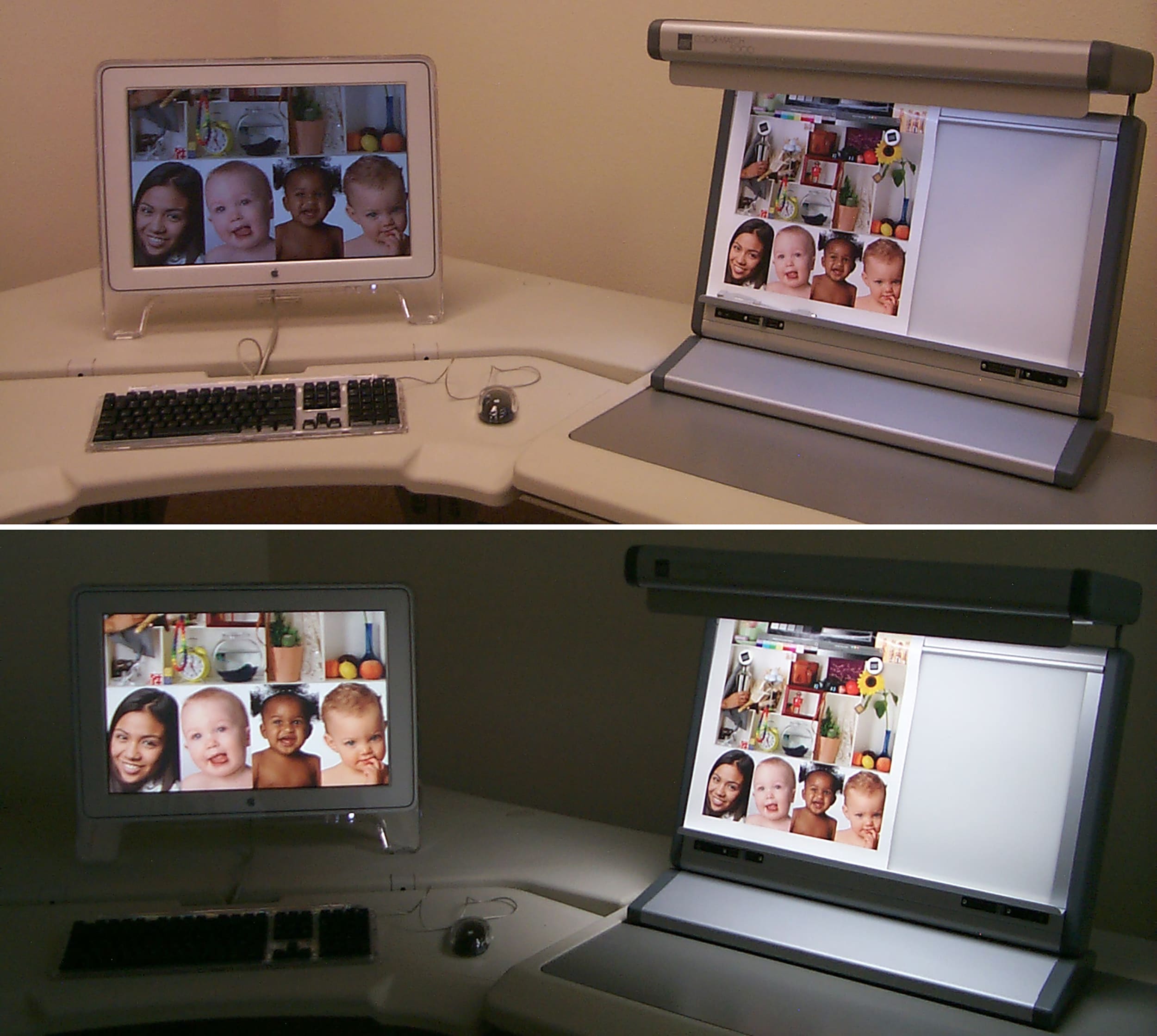
Too much ambient light affects your color perception.
The 2009 version focused its efforts on the F8, or fluorescent tube, to simulate Daylight at 5000K. The manufacturing tolerances defined were intended for fluorescent lighting.
There’s a new version of ISO 3664 under development to accommodate the changes in lighting since 2009 with the transition to LED lighting. In the next issue, we’ll look into the changes in graphic arts and printing lighting.
PHOTO GALLERY (8 IMAGES)


Printvinyl Scored Print Media
New Printvinyl Scored wide-format print media features an easy-to-remove scored liner for creating decals, product stickers, packaging labels, and more. The precision-scored liner, with a 1.25” spacing on a 60” roll, guarantees a seamless and hassle-free removal process.


PRINTING United Alliance Redefines Industry Membership With Growth, Advocacy, and Education

Lasting Impressions: Wide-Format DTF Equipment March-April Products

STS Inks XPD Direct-to-Film Printer and Inks


Bulletins
Get the most important news and business ideas from Big Picture magazine's news bulletin.
-

 Awards1 month ago
Celebrating the 2025 Best of Wide Format Awards Winners
-
 Case Studies2 months ago
San Antonio College Pantry Gets a High-Impact Makeover From Area Wide-Format Pro
-

 Headlines1 month ago
Promo and Print to Converge at PRINTING United Expo 2026 With ASI Show Pavilion Debut
-

 Press Releases2 months ago
Mimaki USA Announces Tx330-1800 and Tx330-1800B Digital Textile Printers
-

 Columns3 weeks ago
Stop Asking for Google Reviews — Instead Request Client Referrals
-

 Product Wrap-Up2 months ago
Rolling On: Print Pullers for January/February Products
-

 Best of Wide Format4 days ago
Heritage Meets Horsepower in Custom Wrap for Competitive Pulling Tractor
-

 Case Studies3 weeks ago
Florida Wide-Format Pro Helps Tow Truck Company Brand Its Big Rigs