Case Studies
Six Tips for Better Dynamic Digital Signs
Best practices from Randy Dearborn.
Printvinyl Scored Print Media
New Printvinyl Scored wide-format print media features an easy-to-remove scored liner for creating decals, product stickers, packaging labels, and more. The precision-scored liner, with a 1.25” spacing on a 60” roll, guarantees a seamless and hassle-free removal process.


Check Out the Great Info in the July/August Issue

National Workaholics Day, Interns Day, and More July/August Dates for Print Pros

Kill an Obsolete Project, Survey Competitor’s Websites, and More To-Dos for July/August


Bulletins
Get the most important news and business ideas from Big Picture magazine's news bulletin.


-

 VEHICLE WRAPS + GRAPHICS3 weeks ago
As the Wrap Market Surges, Technology Keeps Improving
-
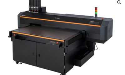
 Press Releases3 weeks ago
MUTOH Wins 2024 EDP Award “Direct to Shape Printer” for Its XpertJet 1462UF
-

 Case Studies3 weeks ago
At This Pennsylvania Printer, Color Consistency is King
-

 Case Studies1 week ago
Former Frito Lay Delivery Van Becomes an Eye-Catching Catering Vehicle
-

 Benchmarks3 weeks ago
3 Food Truck Wraps Where Skilled Designers Overcame Tough Technical Challenges
-

 Press Releases2 months ago
Avery Dennison Sponsors 2024 Design-a-Bus-Wrap Student Art Contest
-

 Press Releases3 weeks ago
PRINTING United Alliance Announces 2024 Pinnacle Award Winners
-

 Press Releases2 months ago
Konica Minolta’s AccurioJet KM-1e Shines at 2024 In-Print Awards