In a brick-and-mortar setting, the storefront or front entry of your building can often persuade customers to come inside. Even if you rarely deal directly with the general public or take on over-the-counter jobs, your storefront should engage and invite, not push away prospective clientele (or, worse, indicate that running directly to your nearest competitor might be a better idea).
Similarly, your company's website should be just as engaging. In fact, in this day and age, it's easy to make the case that you should be putting more thought, effort, and resources into your online presence than you are into your shop's physical structure. It's one thing to compete with a half-dozen operations in the same city, but in the online world you're competing with hundreds if not thousands of businesses that might be offering similar services. So how do you make your company's website stand out from all those others?
To help answer that question, we point out here just some of the Web features that various print providers around the country are using to better their own sites. You may want to integrate a similar feature within your own website, or perhaps a feature you spot here will lead you to an entirely different solution for your site and operation.
Keep in mind that we're spotlighting various features and individual online pages, not really highlighting any company's entire website for the purposes of this article. Nor are we focusing on e-commerce or directly deriving commerce via your website; we'll focus on this in an upcoming article. In addition, note that our editorial team looks at dozens of print providers' websites each week throughout the course of a year, but we know there are many more out there. If you feel your shop's website has a unique feature or is tackling an online challenge in an interesting way, please drop us a note with your website and we'll follow up.
Make a Splash
Advertisement
How much interest does your home page evoke when it first opens? Ideally, your website's home page should provoke interest, be easily navigable, and not too busy.
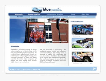
We like what Phoenix, AZ-based bluemedia (www.bluemedia.com) has done with theirs. A large dominant window allows examples of the shop's work to rotate through it automatically, while directly below that window is a clear and concise description of the company and what it does.
The home page features a dual navigation bar: the top (darker blue) bar is application-oriented: vehicle graphics, environmental graphics, and signs. And just in case you're not sure what these applications are, scrolling over each tab pops up a representative image. The bottom (light blue) bar offers the standard 'about us,' 'news,' 'clients,' and 'featured project' pages, all with drop-down menus.
'This is version 3.0 of bluemedia.com-each one getting a little better than the time before,' says bluemedia's Darren Wilson. 'Some of the features we build into the home page and site include: a dedication to simplicity; it's very user friendly and easy to navigate; it showcases our work; and we've made it easy to contact us if needed.' The company also recently launched blueline, its own blog (www.bluemedia.com/blueline).
In the case of Fusion Imaging (www.fusion-imaging.com), Kaysville, UT, a large red graphic visually representing 'fusion' dominates the page, while small images migrate below representing the various applications the shop offers. Notice how key words describing good business partners-'accountability,' 'reliable,' 'expertise'-flow from the right-hand part of the graphic into the main graphic on the left, reinforcing the company's message to prospective customers.
Advertisement
Showcasing Your Best Work
Some shops still fail to post images of their recent jobs. Typically slugged as a gallery, portfolio, or 'our work' section, this area of a site enables a shop to show off a company's best work and to indicate the breadth of that work. Some shops routinely post images of every job they do, while others are more selective, only posting some of their hottest projects.
For its 'Gallery' page, Kubin-Nicholson (www.kubin.com), headquartered in Milwaukee, has divided the examples into three sections: outdoor, P-O-P, and environmental graphics. Click on any of these three categories and up pop five to eight samples of each, complete with image and basic information about the job. For example, for a L'Oreal project, the caption reads, 'L'Oreal Building Walls, NYC, McCann-Erickson, NY. 50 x 21- and 50 x 16-ft. Printed digitally at 150 dpi, 8-oz. mesh.'
Joseph Merritt & Co. (www.merrittgraphics.com) has taken its gallery section to the next level by adding audio narratives as well as moving images to text about each project. Each project example comprises an introduction, a description of the challenge the shop faced, how the shop tackled the job, and specific job specs.
And, there's something to be said for being different. When you click on the 'enter site – high bandwidth' button on the home page for USA Image Technologies (www.usaimage.com) in Louisville, KY, a monotone montage of about 24 jobs the shop has done pops up. As you scroll over each job, the image 'colorizes;' click on it and the image becomes full-size. Information on the particular job as well as more general info about how USA Image tackles this particular type of application accompanies the image.
'We wanted to bring our gallery to the forefront of our website,' says Judd Morgan, sales/marketing director of USA Image. 'By placing the gallery on a menu bar, you're only exposing your client to one static or scrollable image at a time-with a limited amount of time on the clients' behalf, they will never see three-fourths of your gallery. This can make it very difficult to convey what grand format printing is. By placing these building, vehicles wraps, banners, billboards, etc., on the home page, however, we can showcase our product line as well as give a background and choice of applications to choose from.'
Advertisement
An Office Tour
Providing images of your shop-interior shots (lobby, sales department, production floor) as well as exterior shots-can be a good way to lend personality to your company’s website. OAI (www.oaicorp.com) in Tampa, FL goes this idea one better. Rather than simply providing static photos of the outside of the building or even on-floor production shots, it has established a virtual office tour of its entire operation.
The right-hand side of the popup screen allows you to choose which shop area you want to 'visit,' while the left-hand side of the screen provides you with a look at that area from a particular point of view. You can turn the 'camera' as you see fit. And you can jump from one area of the shop to another-from shipping and screen print, for instance, to wide format, to lobby and sales. A small control panel beneath the image in the pop-up window allows for easy navigation.
'We like to provide tours for as many of our customers and prospects as we can so they can see how the operation is run,' says Michael Garcia, OAI's president. 'In order to convey this information to more people, we decided to go with the virtual tour idea. When we contacted ad agencies and photographers to film such a tour, however, the price was running $20,000 to $25,000. We solved the problem by utilizing a photographer that does real-estate tours for the real-estate market. The price came in at under $2000.'
Big Image Graphics (www.bigimagegraphics.com) in Richmond, VA, also offers its own 'Virtual Tour' of two areas of its operation: the press room and the finishing room. Controls within the pop-up window allow the viewer to pan left and right (as well as up and down) and zoom in and out.
'With everyone so busy these days and travel so difficult at times, we know that some customers would not be able to physically make the trip to see us,' says Billy Johnston, president/CEO of Big Image Graphics. 'This gives them the opportunity to get a feel for who we are without having to leave their desk.'
And, at Austin Graphics (www.austingraphics.com) in Austin, TX, the shop has rigged up a live Web cam-'AG Production Cam'-on its production floor, allowing the site visitor to see what’s transpiring in one area of the production floor. The cam refreshes every 10 seconds on Firefox and Safari ('Internet Explorer and Netscape users view at your own risk!').
'The live Production Cam is a feature that we put in place about 7 years ago to allow our customers the opportunity to watch their vehicles being wrapped,' says David Pesnell, Austin Graphics' president. 'A recent customer was having his wife's VW Beetle wrapped as a gift, and kept calling us because he could not see the vehicle on the web cam. Not uncommon, other than that he was calling from Iraq. So we were happy to reposition the car to accommodate him.'
Putting Faces with a Name
Shops sometimes forget that customers want to deal with people-not machines or websites. To make this easier, it's important to highlight the staff. Many shops address this by simply running a single group photo, perhaps with a list of names. But this rarely helps the website visitor get a true feel for the shop and, importantly, how much expertise that staff has.
Two examples here:
On its 'Obligatory People Page,' Vision International (www.vision-xxl.com) in Salt Lake City mixes photos of its executive teams with personal information and some irreverent humor as well. 'We are just trying to show a little personality and that our company is made up of talented and interesting people,' says Gene Chambers, Vision's vice president of sales and marketing.
The aforementioned OAI goes one step further on its 'Meet the Staff' page. While it does provide the single group photo, it also provides pictures and biographical information on the executives as well as the company's entire staff. You can search by company department (digital superwide, art, accounting, etc.) or you can simply scroll down the entire list.
Highlighting In-House Technologies
Icon Digital Productions (www.iconprint.com), in the Toronto, Canada area, recognizes that some customers are intrigued by what type of equipment is being used. With that in mind, the shop has added an Equipment sub-page to its 'How We Do It' page. But it's not simply an equipment list or roster, as many companies produce. Instead, each piece of equipment on the list can be clicked on to produce an image of that equipment (either solo or in use by shop personnel), as well as some verbiage about the equipment, its advantages, and some specs.
'We have good machines here and we like to point out their capabilities for the experienced print buyers,' says Peter Evans with Icon. 'In addition, many clients look for brand-name printing-EFI-Vutek, 3M, and so on.'
You can also highlight a certain machine or technology by showing it 'in action.' For instance, Design Image (www.designimage.com), in Maryland Heights, MO, has dedicated a separate page of its website to its i-Cut machine-and added a QuickTime video of the machine as it works.
Tools for the Customer
Providing current as well as prospective customers with quick and easy solutions to their most basic problems can generate more interest than you might think-and it can head off potential problems as clients calculate what they believe they need from you. Meisel (www.meisel.com), Dallas, TX, provides four different calculator tools to its online customers: a DPI Calculator, a Proportion Calculator, a Thickness Calculator, and an Upload Calculator. 'We added this section to our site to better serve our clients,' says Hoddy Peck, Meisel's executive vice president.
Helping Find Solutions
Keep in mind that customers are not necessarily seeking certain types of printing or even specific applications; instead, they often are seeking solutions to visual problems. Click on 'Solutions' on the home page for OnPoint Visuals (www.onpointvisuals.com), Yulee, FL, and you're provided with a secondary tool bar listing eight applications including: tradeshows, retail, pro sports, architectural, museums, municipal, outdoor events, and collegiate. Click on any of those eight applications, such as 'Pro Sports,' and you're brought to that solution's page, complete with a dominant image and introductory text, as well as specific applications plunked into 'outside' (special event banners, signage) and 'inside' categories (light boxes, championship banners, dasher boards). Each sub-application lists advantages to the application type, details on the application, and even the printer they'll likely utilize.
'In the world of large-format graphics, there's often too much of a focus on the technologies used to print the graphics and not enough on what the graphics will be used for, and why. This can be especially evident on print providers' websites, where they're justifiably proud of their big printers (with equally big investments that go with them),' says Bill Anderson, director of marketing/business development, at OnPoint Visuals.
'But from the end user's perspective, do they really care which printer you're using, or substrate, or any of that? They just want bright (or correct) color that looks good and fills their need. That pretty much sums up why we included a Solutions section on our website, and made it the first menu item: a general overview of where, when, why, and how to use large-format graphics. We of course mention our printers and link to the more detailed technology-oriented pages for those that are interested.'
Steering Customers to Find What's New
When it comes to 'What's New' sections on your website, it's important to keep the information fresh-or at least fresh-looking. If you cannot update this type of section frequently, then don't date your items.
Importantly, the items in a 'what's new' section shouldn't be of interest only to your internal staff or simply be objective news. Rather, these items should steer customers and prospects to take advantage of new services you might offer, new technologies you have put in place, new systems that cut down on turnaround time, and so on. ColorX in New York City (www.color-x.com), for instance, has done just that on its “What’s New page,' where it highlights its ability to print white on rigid substrates.
Gregory Sharpless is associate publisher/editor of The Big Picture magazine.


 True Tales2 months ago

 TIp Sheet2 months ago
 Press Releases1 month ago
 Press Releases2 months ago
 Press Releases1 month ago