How does someone express the idea that our fragile environment is in trouble? Scientists and researchers use numbers and statistics to communicate this point. Activists and politicians may relate a story full of detail and examples to get their statement across. Fine artists, often without those same communication tools, often create artwork that visually speaks to the subject matter.
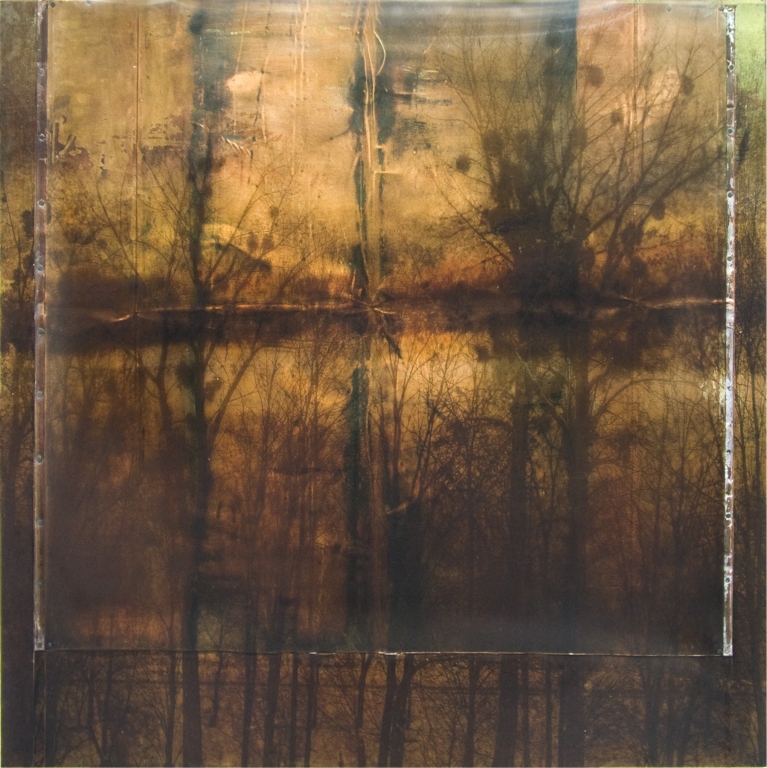
Artist Dorothy Simpson Krause did just this with her recent exhibition “Losing Ground”—a visual commentary on how the effects of a growing global population and global warming are causing a figurative and literal loss of ground.
For the exhibition, Krause produced 19 wide-format pieces using a trio of printers: an EFI Vutek PressVu 200/600 UV flatbed, an HP Designjet Z3100, and an Epson Stylus Pro 9600. She integrated several artists’ books into the exhibition, as well, which were printed on an HP Indigo digital press 5500, among others. This past May, the exhibition was shown as part of the Boston Cyberarts Festival at the South Shore Art Center, the end result comprising 19 wide-format prints that each have a distinctly different look, but come together to make a cohesive collection and powerful statement on the beauty of nature.
Capture and scan work
Krause began her work on “Losing Ground” nearly two years ago, although creating art with an environmental slant has been something she’s been doing for the past several years. “For about four years now, I’ve been working on things related to the land.” In addition to addressing global warming, Krause says her work has also focused on building projects that encroach on green spaces.
For “Losing Ground,” Krause began by taking photographs and creating paintings of landscapes and scenes in nature. With each photo and painting, Krause wanted to convey the beauty and preciousness of the environment. For example, in Saquish, Krause captured the sand dunes of Saquish Beach in Massachusetts. The fence in the image, she explains, is put up as a barrier to keep sand from blowing and to help secure the dunes. “It’s a beautiful place to live. I just hope people begin to more deeply appreciate the beauty of their own surroundings.”
To capture her images, Krause used an older 5.5-megapixel Olympus digital SLR. For this work, Krause says that she’s happy with the images the camera produced because, oftentimes, her photographs are intended to look more like a photo than a painting—“soft-focus images with the deliberate loss of detail,” she says.
Krause then scanned her paintings with a Microtek 9800 XL Scanmaker scanner and combined the scanned paintings and digital photos in Photoshop, working at times with up to 30 layers in Photoshop.
Advertisement
Her work, Krause explains, continues to evolve after the images are combined. “Sometimes I’ll scan a painting, print it, then paint back on top of it and then scan and print it again. It’s a ‘looping’ process. At some point, though, I stop and say, ‘Enough.’”
Fusing art with technology
After finalizing the PSD files, Krause then embarked on the printing side of things. To output the files, she teamed up with EFI Vutek, a company she has worked with many times in the past. The output for the largest pieces would be done by the printer OEM itself.
For 13 of the 19 final prints, Krause output her images using a Vutek PressVu UV 200/600 with UV curable inks onto an array of media (depending upon the individual artwork), including:
• Brushed aluminum Dibond;
• Wood textured with a fresco mix of plaster and rabbit-skin glue and washed with metallic pigment;
• Clear polycarbonate; and
• Aluminum, textured with chine collé, silver leaf, and mica.
Images were often printed as diptychs, triptychs, or as separate but related images. The final dimensions of the artwork ranged in size from 32 x 40 up to 40 x 72 inches.
The PressVu printer was chosen, Krause explains, “because its speed and ability to print on a wide range of substrates without the need for a precoat make it ideal for printing art.” Another major strength of this particular printer, she says, is its use of white ink. “Making a grayscale mask to indicate where the very opaque white ink should be placed enables you to utilize the reflectivity and color of surfaces such as aluminum and wood, while maintaining the white in your files.”
The UV inkset, she explains, was also ideal for this project because it was able to create the aesthetics she was after. “The UV ink sits on the surface of the media and has a raised quality that can be seen and felt—similar to that of a silkscreen or serigraph,” Krause says.
Because of the unique substrates used, proofing was not an issue for this project. “When you have surfaces that are made of plaster with rubbed metallic, for example, you can’t really test it,” Krause explains, because the inks could look different every time. “In this sense,” she says, “I’m fairly forgiving as an artist. I tend to think that there are very many ways to approach a project.” She also credits the PressVu for being able to eliminate this step. “The Vutek color conversion from RGB to CMYK for printing is so good it makes proofing unnecessary.”
Advertisement
The 13 prints were output in a single day. Most of the images printed on polycarbonate, Dibond, and aluminum surfaces were relatively thin, and Krause later gave them “depth” by building various structures on which to mount them. For the pieces on polycarbonate, for instance, she constructed 1 x 3-inch wood structures with plywood surfaces; she covered the plywood with copper leaf, drilled holes into the four corners of the polycarbonate, and bolted it to the copper-covered plywood. For the Dibond pieces, the structures were built from 1 x 2-inch wood and the Dibond glued directly to the structure.
Two pieces, however—Anhinga and Scilia—took advantage of the PressVu’s ability to print on surfaces up to 1.75-inches deep and didn’t need mounting. Those images, says Krause, were direct printed onto hollow core doors, which had been coated with plaster and rubbed with a metallic pigment.
Beyond the flatbed
The six other prints in the exhibition were printed with pigmented inks using Krause’s in-house HP and Epson printers.
She used an HP Designjet Z31000 with HP Vivera pigment inks to output three of the pieces onto a 12-mil transparent inkjet film from Intelicoat. The film was then nailed to recycled roofing copper and glued to the surrounding wood.
The three other works were printed on an Epson Stylus Pro 9600 with Epson UltraChrome ink onto pre-coated aluminum and steel. In this case, the Epson printer was utilized because the Epson’s 1.5mm head clearance could accommodate the thickness of the substrates, close to 60 mil, says Krause.
Black Gold, a piece by Krause with a similar environmental message, was yet another work in the exhibition and used yet another technology: offset printing. Created in November 2007, Black Gold was produced by scanning a metal and plaster surface and then reshaping it in Photoshop to match the designated press dimensions. Krause divided the Photoshop file into three separations, which became silver, gold, and black offset plates. The print was output using a Heidelberg Offset Lithography press with metallic inks. The piece also incorporated digitally printed silk tissue output with the HP Z3100.
Advertisement
Print on demand and more
The exhibition also included six 12 x 12-inch artists books related to the environment. These were made using a variety of materials and binding techniques and included images from many series of Krause’s work, spanning more than a decade. One book in this series, which shares the same name as the Losing Ground exhibit was printed in several different editions that combine traditional printing and print-on-demand technology.
Two editions of Losing Ground were printed by Acme Bookbinding with an HP Indigo 5500 on Mohawk Options 65# made from 100-percent post-consumer content. A limited edition of 100 was bound in a natural black fabric, while a deluxe edition of six books was printed by Harcourt Bindery.
Both the limited and deluxe editions include details printed on vellum, silver and photo gloss papers using the HP Designjet Z3100 and tipped into the book. Krause also added other details by hand, using stencils cut on a Universal Laser Systems PLS4.60 engraver, graphite, colored pencils, markers, metallic pigments and gold leaf. A 7 x 7-inch unlimited consumer edition of the book is also available online via viewpointeditions.com.
“Losing Ground” was installed at the South Shore Art Center in Boston at the end of April and remained on display through the end of May. Images of the artist’s work remain posted on her website, dotkrause.com.
Freelance writer Clare Baker is based in New York City. She is the former associate editor of The Big Picture magazine.


 VEHICLE WRAPS + GRAPHICS3 weeks ago
 Press Releases3 weeks ago
 Case Studies3 weeks ago
 Case Studies1 week ago
 Benchmarks3 weeks ago
 Press Releases2 months ago
 Press Releases3 weeks ago
 Press Releases2 months ago