Graphic designer Martin Charles of Sagaboy Productions has helped set the scene for some of the most famous movies in modern times. He has more than 90 film and TV projects to his name, including the recent post-apocalyptic drama “Finch.”
Charles’ latest project, DC Entertainment’s “Black Adam,” starring Dwayne Johnson, brought with it new graphic challenges. The film, which chronicles the life of DC Comics’ character Black Adam, includes scenes featuring a written language that Charles created for the fictional nation of Khandaq.
In the images that follow, learn what types of graphics were required for the film and how Martin used design to bring viewers into the action – in his very own words.
Photos and quotes courtesy of Roland DGA.
What initially drew you to the “Black Adam” project?
Martin Charles: Production designer Tom Meyer had his eyes set on “Black Adam” for a while, and as soon as we wrapped up the last film we worked on – “Finch” – he started the conceptual phase of the project. He invited me to join him and of course I said yes, leaving everything else behind. There was a little wait to get started but it was worth it.
Where were you based for this project? Were you able to produce graphics on set?
MC: We initially started the project at Warner Bros. Studios in Burbank, California, and then moved to Atlanta, Georgia, where we built the entire movie.
My graphics department was pretty much on set, with about eight sound stages in proximity, plus the entire backlot where we created the exterior of the city of Shiruta.
What was the timeframe for this project?
MC: The project took about eight months from start to finish, working with two additional graphic designers.
You have designed many imaginary worlds – what were some of the most important graphic themes you developed for this film?
MC: I had been told from the beginning that I would need to create an entire language based on countries in the Arabian Peninsula that would be graphically portrayed in both ancient and modern times.
How would you describe the “look” of the movie? Did your design work involve a lot of research?
MC: Picture a well lived-in Arabian country! Tom Meyer’s vision was to design a city so real that one would have serious doubt that it was made up. I think we were successful in accomplishing that goal.
MC: The research was one of the most important elements as we created our own country. It needed to feel like the neighboring Arabic countries but be uniquely fictitious.
What printing equipment did you use on this project?
MC: My Roland DG VersaUV hybrid UV wide-format printer was the primary workhorse for this project, as the bulk of the printing was on roll and rigid substrates – mostly posters and displays – which were more in demand.
MC: I used my Roland DG Soljet wide-format printer/cutter to help with production power. Having two printers, essentially allowing for twice the speed, was really important as we were printing 24 hours a day. As always, the colors were flawless.
What graphics did you use to produce this film?
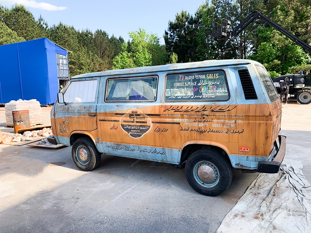
MC: Think about the graphic richness in that part of the world! We replicated everything from backlit light box signage to dimensional signs.
To achieve the look we needed, we digitally aged all the signs about 25 percent before printing. They were used as a pounce pattern for mounting dimensional letters.
MC: For this film, I printed on glass, clear film, fabric banner, every possible adhesive vinyl, posters, and every possible rigid substrate that would run through the VersaUV. I easily printed about 10,000 square feet of graphics.
What graphic really stood out to you? What made it special?
MC: It’s hard to point out just one graphic because everything in this film was quite special. One design that really makes an impact is shown right when the film opens. There you see the tomb, with its walls and floors covered in the ancient language that I designed. That sets the tone for the rest of the film.
MC: Later, as you enter the city of Shiruta, you’re surrounded by dramatic graphics and signage. Each design you see is unique to its establishment.
MC: You can imagine the intrigue and challenge in developing an entire language as it would have appeared thousands of years ago, as well as showing it in current day, around 1997.
MC: I made use of the UV printer’s white ink when printing on clear media. Since we did a lot of exterior signage, the durability of the UV inks and the fact that they are waterproof were important to the project.
How did your printing equipment perform for you?
MC: As always, my Roland DG printers were incredibly reliable. It’s nice to know that all you have to do is equip the printers with inks and give them a design to print. The devices performed flawlessly all day and all night – which is often what’s needed in film and television work. They are true production machines!

16 Digitally Printed Graphics from DC Entertainment’s “Black Adam”
Graphic designer Martin Charles of Sagaboy Productions has helped set the scene for some of the most famous movies in modern times. He has more than 90 film and TV projects to his name, including the recent post-apocalyptic drama “Finch.”
Charles’ latest project, DC Entertainment’s “Black Adam,” starring Dwayne Johnson, brought with it new graphic challenges. The film, which chronicles the life of DC Comics’ character Black Adam, includes scenes featuring a written language that Charles created for the fictional nation of Khandaq.
In the images that follow, learn what types of graphics were required for the film and how Martin used design to bring viewers into the action – in his very own words.
Photos and quotes courtesy of Roland DGA.