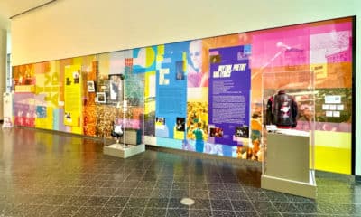
If America is a melting pot, then its airports are where the simmer starts. Walk through any concourse and you’ll find a medley of travelers; a mixture of races, classes, nationalities, genders, and ages. In other words, it’s a textbook environment to gauge the responses of a variety of consumers. Because there’s such a broad audience and a naturally busy atmosphere, it’s easy to see why digital signage is so prominent. As travelers, we already arrive as consumers; we’ve paid to be there. And even though there are plenty of distractions, we’re still basically a captive audience. The screens may have our attention – at least initially – but can they keep it?
I’m a frequent airport visitor; a travel veteran who typically takes 25 to 30 trips a year. Because of my experience, I’m quick to take mental notes on the signage I see. And I’ve seen good, bad, and lost opportunities, especially at my home airport, Charlotte Douglas (CLT), and, recently, at Texas’ Austin-Bergstrom (AUS).
Retailers and food service companies that manage locations within airports were early adopters of digital signage because non-traditional layouts keep space at a premium. Plus, owners must add or change content regularly (more so on menu boards, but also on informational signs). The environment also lends itself to embracing technology because the industry itself was born from and continues to grow from innovation. It’s kind of the perfect storm, and maybe only one of a few areas where the three major types of digital signage are displayed:
• In-store, meaning menu boards, P-O-P displays, or any signage in the actual store promoting those products sold there;
• Informational, including wayfinding and internal communications;
• And ad roll, representing advertising that is outside the actual location or environment.
There is little consistency or uniformity in design or hardware among these three types, typically because each is owned and managed by a different company. Despite the potential benefits of centralizing the signage – cost savings, having a general theme on design, and using the same types of screens – there are probably too many industry players involved to streamline such a feat.
In Store
Unfortunately, I still see my fair share of static screens with flashing JPEGs. It’s 2015, and if this is what you’re doing with your brand, stop. Invest in software that allows for multiple types of media to be played and that can be updated from anywhere. There are many great products out there with a range of functionality. Cost should also no longer be a barrier to using good software, as many platforms are available that can fit any budget. Do it right or just don’t do it.
One regional quick-serve restaurant I noticed on a recent trip, however, did have some good content. They used four 40-inch screens to display menu items and a few images. They used a black background with white font, so it was very readable because of the sharp contrast between the light and dark. I especially liked the tiny touches of animation they used, including showing an entrée then adding the combo items (a great strategy for upsells), plus using their logo and tag line. However, the font and design elements used did not appear to be the same ones used in the brand’s traditional stores. Why does this matter? Because established brands have guidelines and often very recognizable colors and font. When stores have one-off locations that don’t follow the brand, consumers, although subconsciously, may not register this experience as being consistent. Consistency matters; otherwise, style guides wouldn’t exist. In addition, the resolution was incorrect, causing the letters of the first and last words to be slightly cut off. This is something that should have been noticed and addressed at installation.
Advertisement
Another area that needed attention was space allocation. In an attempt to repurpose content, a quarter of one screen was used to display commercials. While the content itself was fine and complemented the menu board design, there was an unnecessary addition: audio. Sound has no real value in digital signage unless it’s in an isolated area. Airports are loud. Sound coming from yet another place just adds to the noise.
There was also a missed opportunity. A separate print poster was directly above the register. The poster announced new items – likely test items. If a smaller promo board had been added to advocate this and also to allow for easy changes, then the brand could have better evaluated the success of the new items. They would have stood out rather than just sinking into the backdrop.
I also spotted retailers using in-store and P-O-P displays to advertise the latest bestseller or travel accessories. Of particular interest were some kiosks I spotted at AUS. Who knew makeup was such a hot commodity at the airport? Two popular cosmetics retailers had well-designed, compact kiosks. They integrated both printed pieces and digital screens. The products were well-displayed, and the graphics eye-catching on both the printed and digital areas. The small touch screens provided the user the ability to scroll through products, get details, and make a purchase. These stylish kiosks are becoming very popular and are self-service, so no human labor is required to sell the product.
Informational
Most of these signs are trying to communicate where you are, where you need to be, and what’s on the way. These screens tend to be somewhat larger than menu boards or P-O-P displays. The text is larger, too, to allow for readability from farther away.
With their mazes of corridors and concourses, airports have an amazing opportunity with wayfinding. People barrel off the plane into the gate and are immediately seeking information: Where’s my next gate? Where do I find my shuttle? It’s nice to give consumers what they want and driving information digitally works – it’s easy to see, can be placed strategically, and is easily changed.
Some airports do have very unique, interactive directional digital signage displays, but they’re the exception. Most just don’t have the ingenuity or creativity. CLT hasn’t updated or changed much about their informational signs in a while. Updates have been made in many key areas to address modern aesthetics and to be more functional, but digital signage boards seem to have been forgotten. Here’s some unsolicited advice:
• Update the design with more modern elements and font choices;
• Make an impact by being clever – use a conversational, personal tone to inform;
• Use the platform to address what’s new – in an ever- changing environment like an airport, the landscape changes regularly, so keep the audience informed;
• And add some color. With black bevels and a black background, there’s a lack of brightness, so my attention isn’t drawn to the screen.
Advertisement
In contrast to what CLT offers, AUS has a fresher approach. Most of the informational signs have slight or no bezels, allowing for more room and a cleaner look. The font and graphics are also more uniform and contemporary throughout. While CLT is a much larger and busier airport, AUS has the edge on forward-thinking digital signage.
Ad Rolls
This type of application is generally facilitated by the airport. They sell ad space or time in the same way they would for print installations. CLT has some room to grow here, which I realized when comparing it to Austin. AUS has ad roll signage next to the ETA screens, exposing many more viewers to the ads. These ads focus on what makes their city great, highlighting tourist attractions, dining, and historical landmarks, while the ad rolls at CLT are more focused on airport hotels, transportation, and local universities. To make their ads more successful, CLT should consider installing some video walls and focusing on some of the more interesting parts of the city. If they are having challenges persuading would-be advertisers, they only need to mention the thousands of eyes that could glimpse the ads every day.
Airports are the beginning and endpoints of so many journeys, filled with consumers who need everything from snacks to souvenirs. Correctly implemented digital signage is a perfect application to amuse, inform, and persuade this captive audience. As I gear up for a busy span of travel, I’ll have the opportunity to see airports both big and small and, of course, I will be looking for their digital signage triumphs, failures, and chances to do more.


 Best of Wide Format1 month ago
 Columns2 months ago
 Best of Wide Format1 month ago
 Best of Wide Format1 month ago
 Best of Wide Format1 month ago
 Best of Wide Format1 month ago
 Best of Wide Format1 month ago